Posts Tagged ‘The New York Times’

Sic Transit Gloria Mundi (Example No. 1)

Saturday, June 29th, 2013

.

On Thursday of this week The New York TImes reported that the Metropolitan Museum of Art has decided, after 42 years, to stop issuing to each museum visitor one of its signature admission buttons. The colorful metal tags are being abandoned in favor of adhesive paper stickers. Cost is the reason.

The writers of the Times article anticipated my reaction: “In an era in which physical objects seem to be rapidly dematerializing into the digital, the loss of a durable little chunk of the Met will undoubtedly be missed.”

This sad news prompted me to dig out of my desk drawer some of the tags I’ve saved over the years.

.

.

.

For many, these are mementos to be saved and cherished. For a few, these objects will continue to form the basis for a collector’s hobby.  As is true when collecting objects — coins and stamps are prime examples — each individual Met badge, once acquired, becomes a piece of a larger puzzle — a puzzle whose solution leads the collector into history, technology, and design evolution. The matter of design includes material, shape, size, color, and image. The questions are endless. Just take a look at the photos of the front and back — no, let’s call them recto and verso — and ideas will pop into your head.  Why, for example, was it decided to extend the color of the disk to the stem of the current (final) design, the one featuring an “M”?  Why does the depth of the “frying pan” differ from tag to tag?

Even among my collection of a mere dozen pieces there are so many variants! I suspect among the millions of Met tags manufactured, there are many accidental variants as well — “errors” that tantalize the collector with the most coveted of attributes: rarity. Note in the second photo how the metal generally is a tin or steel gray color, except for one instance of a brass-like finish. How rare is that issuance? Even more exciting is the middle tag in the bottom row. Its unpierced stem meant this was a flawed badge, sure to fall off of the visitor’s lapel. How many of these are out there? Do I own the “Inverted Jenny” of Met badges?

Hundreds of folks have commented on the Times article, most of them nostalgically. But one of them — Alan Wright (NJ) — offers a warning aimed straight at me:

“The only thing more wasteful than those stupid metal pins is any time spent researching, writing, reading, and commenting on them.”

.

Photoshopping a Tragedy

Sunday, January 27th, 2013

.

The human interest story that’s headlining the news this morning is a nightclub fire in Santa Maria, Brazil. Several hundred persons are dead.

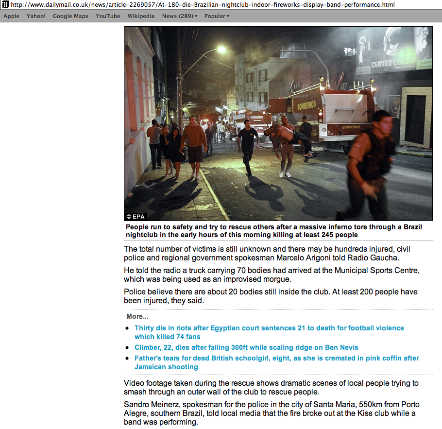
Whenever there is a tragedy of this magnitude it is the sad but necessary duty of journalism to converge on a single photo to illustrate the event. In this event the media quickly anointed a picture with iconic status (attribution: Germano Rorato/Agencia RBS, via European Pressphoto Agency (EPA); AP; and Reuters).

.

.

It is a photo taken on the street outside the club, showing fire trucks and rescue workers and other people milling about. The night sky is hazy, and we correctly read this not as mist but as smoke from the nearby fire. Here is how the photo is presented on the website of the Daily Mail.

.

.

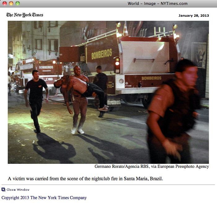
The same picture, but this time in a cropped version, can be seen on the website of The New York Times.

.

.

Someone, presumably an editor at the NYT, chose to zoom in on the central tableau, cropping the photo’s left side, eliminating our view of the sidewalk and pedestrians, setting aside the direct glare of the overhead street light, and also trimming the remaining three borders. The reason for this is not hard to understand and appreciate. The focus of the scene, and what must have caught the photographer’s eye, is an anguished man carrying the prostrate body of a victim. Their vertical and horizontal forms create a cross, the pose of a Pieta. Although it is important for the record — for context, for history — to note that this picture is a detail of a slightly broader perspective captured by the photographer, Germano Rorato, I don’t think anyone can argue against this being a legitimate editorial choice. The fact that the picture’s composition arguably has been improved is not as important as this key observation: the reality of the moment remains undisturbed.

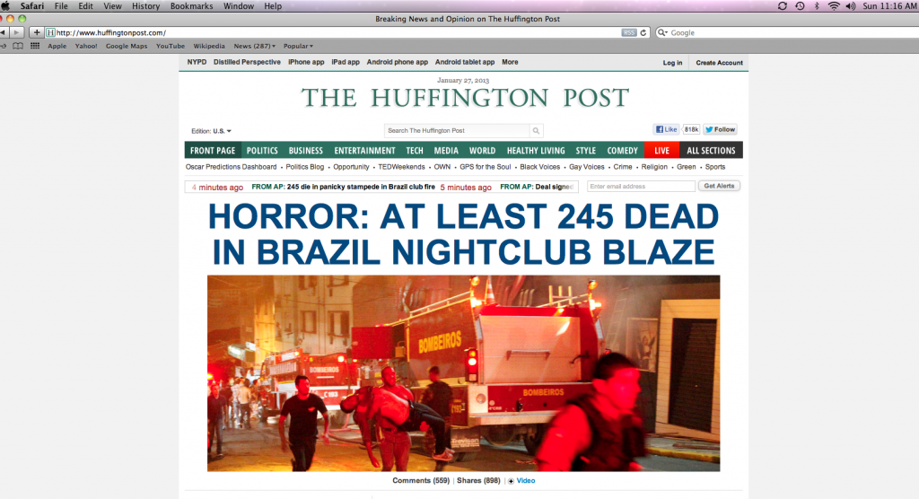
Other media outlets covering the tragedy apparently felt the original photo, in its entirety or cropped to its central focus, was not quite — how to put this? — not quite hellish enough. And so, at some stage in the chain of custody the photo was altered. There was some person or persons associated with the profession of journalism who made a decision to pump up the horror and pass their altered version off on the public at large. How? Easy.

Pretend you’re the lighting director at the Grand Guignol. Throw some switches and wash the scene with lurid red. There, that does the trick.

Here’s how the photo appeared this morning on the Huffington Post, the Drudge Report, and the Washington Post.

.

.

.

.

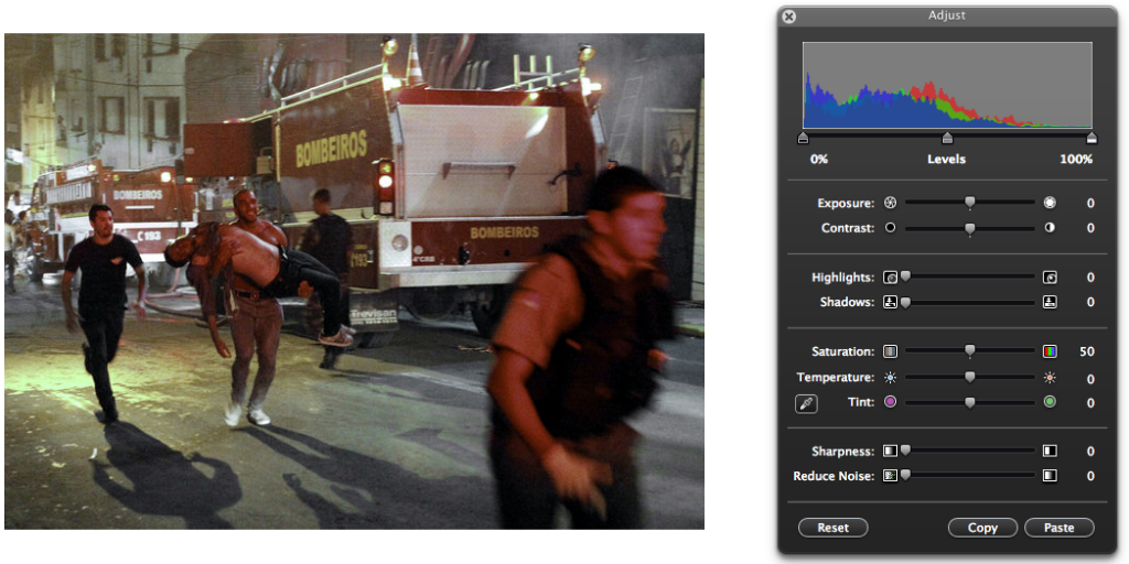
There’s a phrase used in the media to advise against imitating a dangerous activity: “Don’t try this at home!” Yet on this occasion, in this heyday of digital manipulation, the keys to altered reality are not in the exclusive possession of the media. You can try this at home, under safe conditions. Just fire up your favorite photoshopping tool and, after just a few adjustments — Voilà! — you’ve successfully followed the lead of journalists into Hades.

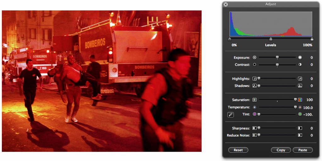
In the example below, I started with the photo as cropped by The New York Times. I color-adjusted it in the crudest way possible on three scales: I increased Saturation to 100 from 50, raised the Temperature to 100 from zero, and shifted Tint all the way left to red.

.

.

.

UPDATE 02-03-2013

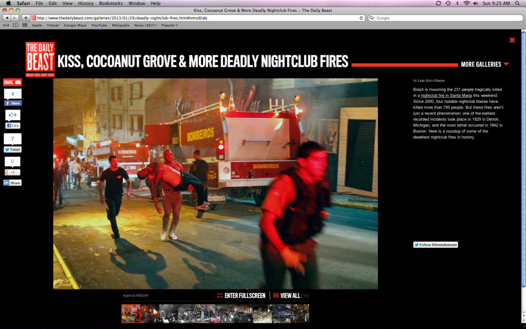
An artificially pumped-up hellish version of the photo (an expert’s manipulation finer than my effort) has become the officially archived memento of the event in The Daily Beast‘s gallery slideshow of “Deadly Nightclub Fires“:

.

.

Oh, what the hell, let me try to match it, once again using as a starting point the cropped original photo that appeared in the NYT, then playing with Exposure, Contrast, Saturation, and Reduce Noise. How about this?

.

.

What’s the Matter with Book Critics Today?

Saturday, January 8th, 2011

.

Over a decade ago the distinguished critic Jonathan Yardley, whose book reviews appear in the Washington Post, observed, “There is no such thing as a powerful book critic.”

That remains true today.

Though there is reason to lament this state of affairs, it is not the diminished cultural impact of book reviewers that worries me. Rather, what concerns me is an overall decline in the quality of book criticism appearing in mainstream media publications. There is still a sizable number of people who read book reviews, and we deserve better.

I’ve been monitoring newspaper and magazine critics’ reactions to “Bird Cloud,” Annie Proulx’s non-fiction book released earlier this week. I’m finding that a diseased strain of “reviewing” — a strain that first came to my attention last year around the time of the publication of Jonathan Franzen’s novel, “Freedom” — appears to be spreading.

I’m speaking of a mode of critical attack that exposes not so much the flaws of the book under review as the deficiencies of the book reviewer who indulges in its practice. This baleful approach is characterized by ad hominem attacks delivered in a voice that blends self-absorbed gusto with made-up grievance.

If this virus has a ground zero it might be an execrable “Freedom” review/profile from the pen of Jennie Yabroff, an article that Newsweek editors unwisely chose to publish last August as another marker in the decline and fall of that once vital periodical.

A month later the self-absorbed component of the style was placed center-stage in a review of Philip Roth’s latest novel, “Nemesis,” in The New York Times. In the piece, Leah Hager Cohen spends the first five paragraphs, a sizable chunk of the entire piece, talking about herself, her history, her touch points with Roth’s oeuvre, her moods, her equivocations, her journey. Yes, it’s all about me-me-me, before I go head-to-head with the author. This diversion into the self is “relevant,” she says. To her credit, she then goes on to say intelligent things about the book, judging it fairly on its merits.

Most of us who’ve reached middle age can sense when someone else has pre-judged a matter. I am especially concerned about reviews that signal the presence of prejudice.

One such stink bomb, a book review that adds to the mix an aggrieved whine and some tired preppy insults, landed in December. In an online review posted by The New Republic, Andrew Butterfield does a hatchet job on Steve (“lazy”) Martin’s novel, “An Object of Beauty.” Typical of Mr. Butterfield’s approach is the bloodless delivery of this calumny: “All [Martin] makes you feel is that your ignorance should arouse your envy—that you, poor thing, are less fortunate than he and the fancy people in his book.”

Now, personal rants of this sort, especially those that rise to histrionic pitch, are usually full of howlers, and Butterfield does not disappoint. For example, his command of the book is so slipshod that he is unable ever to get the book title correct, not even once. Three times he refers to it as “The Object of Beauty.” (But wait, you say — is it possible a gremlin slipped Butterfield a rogue, evil version of the good book I had the pleasure to read?) His paragraph assuring us there has never been an art collector who ever wore an Armani suit is a real hoot.

The decline continues to manifest itself in 2011.

Early in his review of “Bird Cloud” published in the New York Times this week, Dwight Garner lays down a marker, dubbing the book “shelter porn.” It can be viewed, he says, as a product of “a wealthy and imperious writer who . . . believes people will sympathize with her about the bummers involved in getting her Japanese soaking tub, tatami-mat exercise area, Mexican talavera sink and Brazilian floor tiles installed just so.” In truth, the tub installation problem that needed correcting (described on page 118) involved a clogged outflow drain which caused water to leak to the downstairs library, threatening Proulx’s research files and vital book collection. I wonder how Garner would react if his auto mechanic were to chide him for selfishly wanting his oil-leaking car engine tweaked “just so.” Oh, never mind.

Then there are the words “tatami mats.” These four syllables have an exotic sound that attracts easy mockery, but does Garner really want to throw his lot in with the class warriors who made hay of Obama’s expression of arugula-love, back in 2008? And what’s with Garner’s prissy “just so” fillip, anyhow? I defy any reader to come away from “Bird Cloud” with the impression of Annie Proulx as a prissy lady (although I have to admit that taunt — Prissy Annie Proulx! Prissy Annie Proulx! — feels kinda good tripping off the tongue). I also defy anyone to come away from “Bird Cloud” with the feeling that Proulx wants us to “sympathize with her” for any of her travails, large or small.

While others (in Slate and in The New Yorker, before which I normally bow down in awe) are saying sweet things about how clever Garner’s review of “Bird Cloud” is (I agree Garner can be witty, and he delivers verdicts with a good comic’s sense of timing), I have a sneaking suspicion neither of the encomium-givers (Timothy Noah and Ian Crouch) has read “Bird Cloud” in full.

One thing I know for sure: no one’s interested in my reviewing their reviews of a review of a book. To get caught up in the vagaries of a posse of literary critics — a dysfunctional family if ever there was one — is not conducive to anyone’s mental or moral health. So, returning to the merits of Proulx’s “Bird Cloud,” I simply will say as a reader I disagree with Garner. With him you get a twofer: a misunderstanding of the book and a misreading of the author.

There has always been a moral component to the best literary criticism. That tradition, when examining “Bird Cloud,” would call on the critic to examine the environmental ethic so important to Proulx’s experience on her 640 acres of raw Wyoming rangeland. Keep in mind this is land the author decided to purchase by trading in her fair-gotten gains from her writings. The seller was The Nature Conservancy, and it is under the constraints of rigorous covenants that Proulx enjoys the property.

Few if any reviewers appear interested in this aspect of the book. Instead, critics stir up (or, in my opinion, make up) grievances. Garner, for example, finds it “deplorable” that Proulx writes so freely about “the perks of [her] success.” Joining Garner in his descent into status resentment is Michael Upchurch, who, in his review of the book in the Seattle Times, gives Proulx the raspberry for overreaching. He sums up his disdain for the 75-year-old author with this barb: “You wonder if Proulx has a single ounce of common sense.”

A notable element in these complaints is the loopy premise that the status of America’s economic health at the moment of a book’s publication could justify placing cautions, if not actual fetters, on free expression. Can that really be what these scolds advocate? Consider how Upchurch upbraids Proulx: “Her decision to publish this account of her extravagance when so many Americans are losing their homes seems in dubious taste.”

All too often nowadays the cultural impotence of book critics’ messages is matched by the imbecility of their content.

I wonder if it’s time to spin a variation on the Catskills resort joke (the food is terrible . . . and such small portions!).

How about this:  What book critics write is terrible . . . and it has no impact!

.

Better Thought Next Time, No. 3 (Joel Stein)

Tuesday, July 14th, 2009

Joel Stein, humorist and frequent contributor to Time magazine, where his pieces are often the best thing between the covers, is a very funny fellow indeed.  True, his humor is mostly adolescent, and if you’ve been reading his stuff for years, like me, you may be wondering, when is this guy ever going to grow up already?  The answer, I suspect, is never, not ever.  Because on that day he’d have to find another line of work.

Joel Stein has a blog.  Let me correct that:  he had a blog.  Let me correct my correction:  he has a blog but it’s been defunct for nearly three years.  He stopped posting after a final entry dated September 6, 2006.  And from what I saw of his other posts, well, let’s just say abandonment was a mercy.  His heart wasn’t in it (translation: there was no money in it, and as Dr. Johnson said, no one but a fool ever wrote except for money).  Foolishly, I have a blog, and my most recent post is the one you’re enjoying this very moment.  Or it could be that my most recent post is an even newer one, and though hard to believe, the newer post might be even more of a joy to read than this!   

So the question I’m asking is, who is smarter, Joel or me?  And who has more endurance when it counts?  (This may come down to a split decision.)

Before my theme becomes completely stale, I wanted to mention an article by Stein that appeared in the April 16, 2009 edition of Time.  There Joel ruminates at great length on his and other guys’ penises.  He does so  under the guise of examining the great circumcision debate (“Joel Stein Contemplates Circumcision (For His Son),” here).  I’m not saying there’s anything wrong with Joel thinking and writing about his or other people’s genitals.  It’s a potentially humorous subject and Stein is a funny guy (or did I say that already?)  But the article contains one very odd thought, actually a strange thought accompanied by a strange image, that occurred to him in the course of comparing Americans and Europeans.  Stein writes:

“Our penises are clean and sleek and new like Frank Gehry skyscrapers, while theirs are crumbling, ancient edifices inhabited by fat old men in hats.”

Let’s pause for moment.  (You wanted to catch your breath anyway, right?)

OK, then.  Someone’s got to step up to the plate — and I volunteer to be that someone — and ask whether Mr. Stein has even the teensy-weensiest bit of familiarity with the architectural designs of Frank Gehry’s skyscrapers?  Not Gehry’s sprawling horizontal buildings, like the Experience Music Project, with their shiny smooth expanses of titanium and stainless steel, but his skyscrapers.  I’m asking the question rhetorically.  Non-judgmentally, too.

Consider Gehry’s proposed plans for a skyscraper in lower Manhattan:

gehry-skyscraper-lower-manhattan-2006


gehry-skyscraper-lower-manhattan-20091

Sleek?  In these photos do you see anything “sleek” (a word that requires smoothness)?   Hardly.  “Wrinkled-looking [with a] distinctly bumpy silhouette” is how the Gehry skyscraper was described by the NY Times.   Are there really a lot of folks out there who long to stroke this form? (Note to self:  Avoid eye-contact with J.S., lest his hand be raised.)

To read an author is to enter her mind.  Or in the case of Joel Stein, his mind, whenever he’s not stealing thoughts from her.  (I make a little joke, no?)  The consistently clever views that seize Stein’s mind, when put in English and down on paper, make me laugh.  But my message is this:  We can’t trust him with architecture.   He needs to bone up on it.

Now, food — food he knows about, as he’s shown here, here, and most squeemishly here.  I bet if Mr. Stein were to come across the items below (items introduced to my local Safeway some time ago) he would stop and stare and stare some more — and then come up with some funny way to mention this in a column.  Something I’ve been trying to do for weeks. 

spotted-dick-21


They say Joel likes to Google his own name from time to time, something we all like to do.  But he adds this twist:  To protect his fragile ego he sets the search parameters to find only those articles in which the author of the piece writes that Stein is really “funny” and repeats that adjective at least five times within the article.

Hi Joel !