.
Yesterday in Glover Park:
.
.
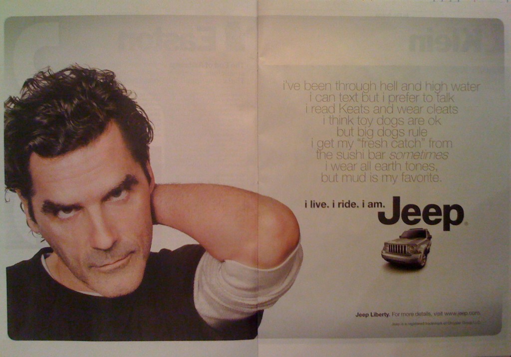
The first six words in the title of this post — if you count each un-capitalized “i” as a word — is the tagline of a new advertising campaign for Jeep vehicles. The campaign’s 30-second TV commercials have not been well received by media observers. See, for example, comments here, here, and here. Jeep is also placing “i live, i ride, i am” advertisements in magazines, and in my opinion these are truly, madly, deeply, bad. I’m talking about text so awful it defies parody. Here is a two-page spread in the December 14, 2009 edition of TIME magazine (pages 34-35):
.

.
The words that appear in faint gray type in the upper right quadrant — the text providing the premise for the punchy tagline — reads as follows:
i’ve been through hell and high water
i can text but prefer to talk
i read Keats and wear cleats
i think toy dogs are ok
but big dogs rule
i get my “fresh catch” from
the sushi bar sometimes
i wear all earth tones,
but mud is my favorite.
Yes, those lower-case “i”s are indigenous to the copy. It wouldn’t surprise me if a phalanx of Apple attorneys were suspiciously eyeing those “i”s. It also wouldn’t surprise me if those same lawyers offer Chrysler, in lieu of crippling litigation, a friendly settlement proposal calling for minor changes in the tag line:
i live. i ride. i phone. i pod. i mac. i am.
But for now let’s give credit where credit is due. It was the Mad Men at Jeep’s advertising firm who came up with the idea of eschewing margins in favor of pseudo-poetically centering each of the nine descriptive lines. And it was their idea to italicize the word sometimes — a nuance sure to render many a reader weak-kneed.
I confess I was puzzled, however, to find the bold lack of punctuation surrendering to convention just when the statement reaches its final two lines. It’s as if the copywriter, almost done with the task, was suddenly touched by the ghost of her tenth grade English teacher, who whispered a plea: A comma and a period, please!
On the other hand, who among us can resist forming a wry smile at the rhyming of Keats with cleats? Clever.
As for the trendy sentiments expressed in the ad, yes, they’re sophomoric. But so what? (The visiting ghost came from the tenth grade, remember?) Maybe the whole thing is an homage to the malarkey found in the Manifesto of Thompson Hotels?
But enough about words. The bigger oddity is the photo in the left panel of the ad. This, presumably, is the Keatsian survivor of the fabled watery hell (or was it hellish waters?). This is a man who does not know for sure whether tonight’s dinner will include sushi. Can you blame him for scowling at us? Of course not.
But I wonder: Why was he asked to take a pose that is in-your-face and awkward, macho and goofy? Hey, I know the arm swing’s a guy thing; I do it too. But here’s the risk: Someone will be tempted to suggest this guy’s next gig ought to be on stage playing opposite Katisha (She: “My right elbow has a fascination that few can resist.” He: “Ditto my left, baby.”)
Is it just me, or do you also find the more you stare at the picture the more his bare forearm looks like a raw turkey drumstick attached to his left ear? (OK, maybe it’s just too close to Thanksgiving for me.) Whether it be a drumstick or an arm, the fact is the thing’s projecting forward from pictorial space, and none too elegantly. As artists will testify, foreshortening can be a bitch. See, for example, Durer’s posthumously published treatise, De Symmetria. So why did the creator of the ad go there, and why compound the problem by featuring a limb that’s freakishly fingerless?
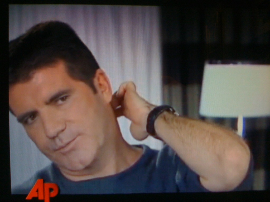
At least when we watch Simon Cowell’s bad habit of scratching the back of his neck, we see him in motion (as in this video at 1:41 – 1:43) and we get to see his hand, as shown in this screen shot:
.

.
[As for the title of this post, if you want to read more about “i yi yi” (aka, “Aye Yi Yi”), an expression used to show frustration, hopelessness, sadness, annoyance, click here and here.]