Why are publishers pseudo-soiling their new book jackets?

October 4th, 2013

A couple of years ago I noticed a flurry of books, written by and about women, whose covers featured images of women in a strange pose: turning aside and away, showing not their faces but their backs to the potential reader. See examples here.

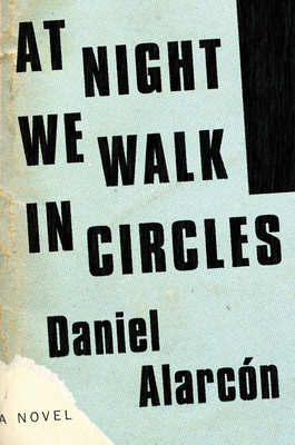
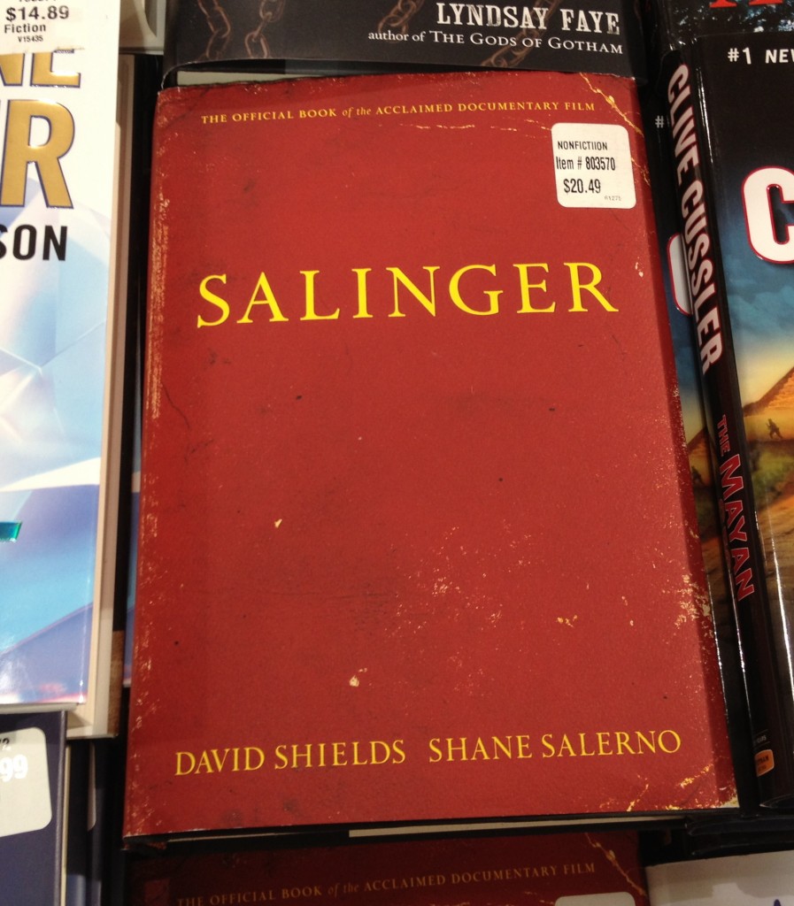
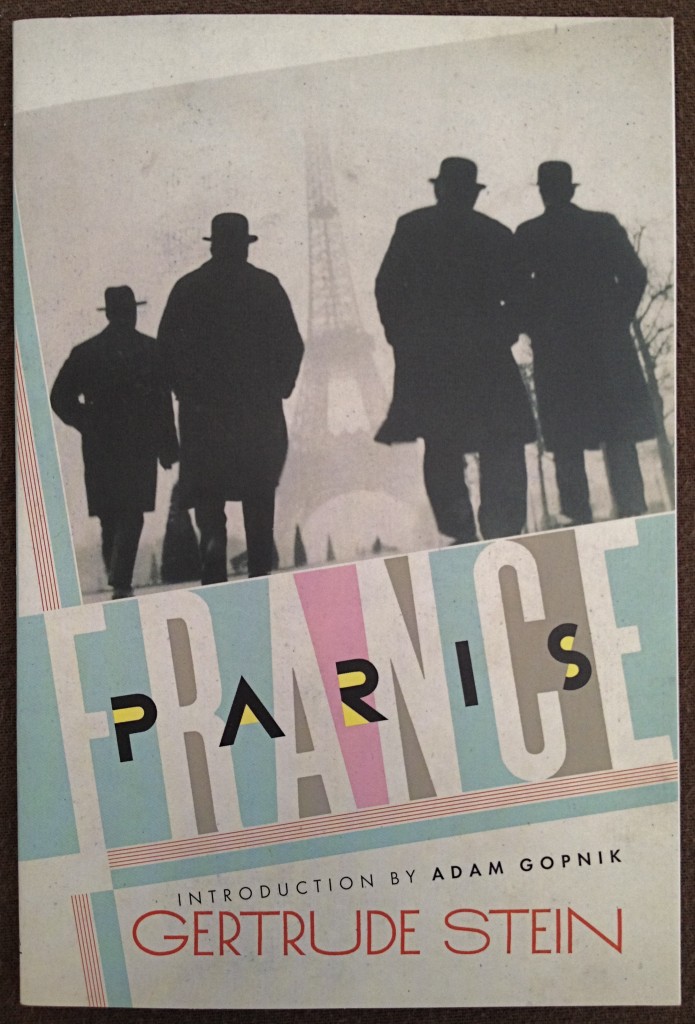
Now another strange phenomenon has appeared: book covers or jackets with a worn, “distressed” look, as if their designers wanted to pre-deliver the tatters and soiling that come from handling a cherished volume over a long period of time.

Examples include a new paperback edition of Gertrude Stein’s Paris France (with subtle age-staining applied front and back); a soon to be released novel by Daniel Alarcón (with similar pseudo-soiling of its cover, simulating the residue of sweaty palms); and that new biography of J.D.Salinger (with pretend nicks and creases fondly recalling your own well-worn copy of Catcher in the Rye).

Set these books on your coffee table, and your “I-much-prefer-used-bookstores” bona fides won’t be questioned.

.

.

.

.

On the tables at Costco, 9-27-2013 . . .

.

What Might Have Been . . . And What Is

September 29th, 2013

In 1999 architect Frank Gehry won the competition to design an addition to the Corcoran Gallery of Art in Washington, DC. On an adjacent vacant property the Corcoran used as a parking lot, the striking new structure would double the space available to the museum and Art School.

In an exhibit shown at the museum in 2004-2005, Gehry presented his revised design, as shown in the photos below. Note: the Corcoran’s 19th-century Beaux-Arts building is on the left side of the model.

.

.

.

.

By 2005 the Corcoran board chairman had scuttled the plan, due to funding inadequacies. In July 2011, the empty property was sold off to make way for a commercial office building. It is now nearing completion. Below are photos of the site taken September 25, 2013.

One could have a lively debate over whether the new structure is as ugly as the dull cast-concrete commercial building directly across the street, reflected — intentionally? — in its mirrored facade. But it would be hard to dispute, no matter where you stand, that here is sad instance of a missed opportunity.

.

.

.

.

.

Dogs Hangin’ Out on the Street — a Google Street View, No. 2

August 4th, 2013

.

.

Location: Intersection of Las Illusiones and Las Margaritas, Santiago, Chile. Image dated January 2012.

.

.

Dogs Hangin’ Out on the Street — a Google Street View, No. 1

August 4th, 2013

.

.

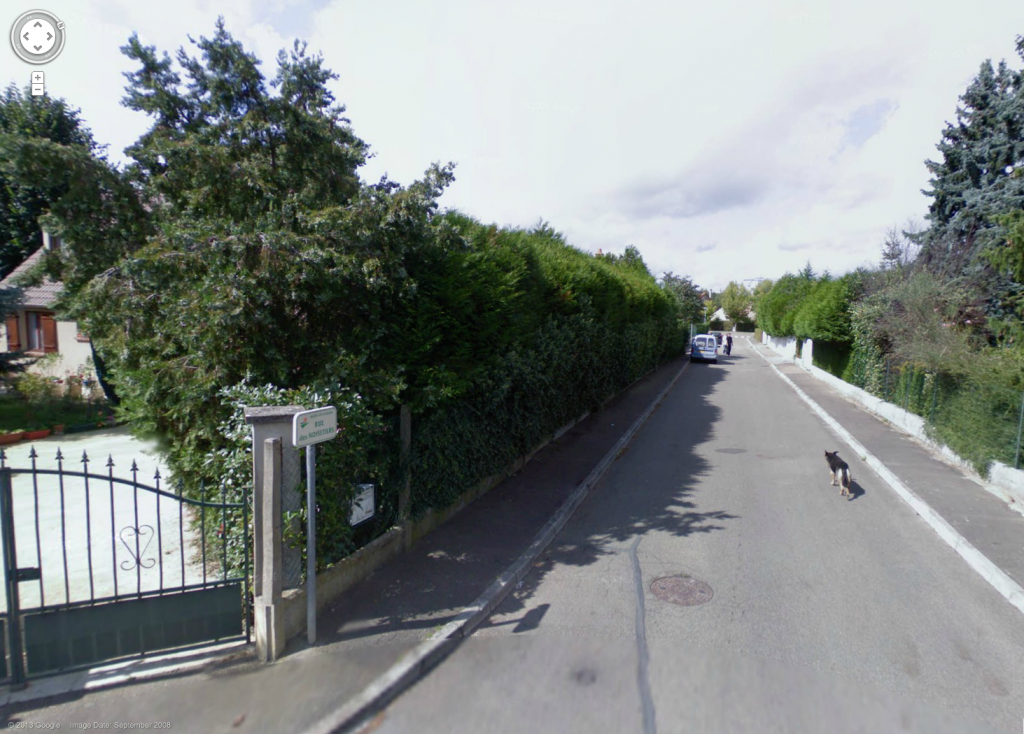
Address: 8 Rue des Noisetiers, near intersection with Rue des Acacias/Rue des Tamaris, 78114 Magny-les-Hameaux, France. Image dated September 2008.

.

.

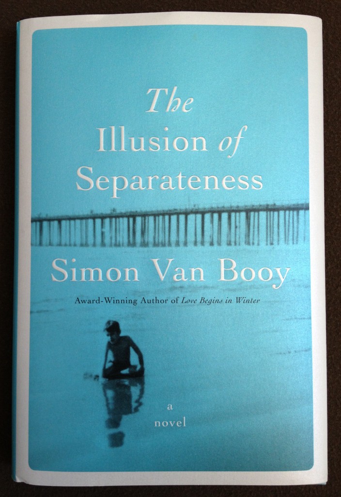
The Illusion of Separateness by Simon Van Booy

August 3rd, 2013

.

.

If you knew ahead of time that a novel you planned to read would become one of your favorite books, would you set aside the time needed to complete it in one sitting?

That’s something to consider when picking up Simon Van Booy’s THE ILLUSION OF SEPARATENESS.

Fortunately, while the book is dense with plot and packed with fully-realized characters, its 200-page length and Van Booy’s fluid prose assure that the goal of a “one-day read” can easily be met.

In its opening chapters the novel plants a series of mysteries about the origins and destinies of a varied set of men and women. Much to the reader’s pleasure, revelations begin to emerge about a third of the way into the book and continue up to its final page. The astute reader will likely guess many of the secret connections among the persons portrayed and solve the puzzle of several who-is-savior-to-whom vignettes. Still, it is a thrill to follow the author’s path as he locks these intricate relationships into place.

The non-chronological presentation of personal histories and incidents, covering a time period from World War II to the present day, is smoothly executed. So too are the literary elements. Descriptions of poetic brevity abound. A character watches a river at night and describes it as “a cool muscle.” Another recalls how, at a lively restaurant, a line of arriving cars “held life in the haunches of their gleaming coats.” Elsewhere, dawn is said to bring “the outlines of things coming–a world drawn fresh from the memory of yesterday.”

The reader is bathed in recurring motifs — of flowers, birds-in-hand, mouths, beating hearts, the sundering of bodies, and conjectures about how each personally important place was different in times gone by (“Our house was once a flock of trees in the wilderness”). You encounter earthly paradox: “Some days the sky was so clear, it was like staring into darkness.” You come across countless references to rain, as in this example which illustrates Van Booy’s animist and anthropomorphizing bent:

“Rain says everything we cannot say to one another. It is an ancient sound that willed all life into being, but fell so long upon nothing.”

At its root, the book’s wisdom is that of religious teaching: “For a long time now,” one of the principle characters reflects, “he has been aware that anyone in the world could be his mother, or his father, or his brother or sister. He realized this early on, and realized too that their lives were merely its conditions. The truth is closer than thought and lies buried in what we already know.”

Or, as another character says: We must remember each of us is “part of someone else’s story.”

.

This review appears on Amazon here.

.
Jesse, golden retriever, 9 years old

August 3rd, 2013

.

.

My golden retriever is now 9 years old. Previous posts about Jesse here and here. Most recent video, here.

.

“The Connoisseur” by Evan S. Connell

July 31st, 2013

.

.

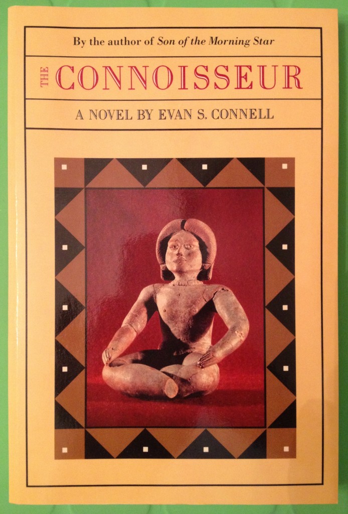
The dictionary tells us that the word “connoisseur” derives from the Old French “conoisseor” — meaning a judge or a person well versed in anything. The term can be traced back even further to the Latin “cognoscere” — to know. Knowing this, it should be no surprise that from the hands of a modern writer, one skilled in social satire and irony, a book entitled “The Connoisseur” will explore the question of how we, poor modern men, struggle to know. And so in what on the surface appears to be a novel of manners, Evan S. Connell sets his protagonist, the middle-aged insurance executive Muhlbach, on a quest for authenticity, exploring depths beneath the surface.

The Connoisseur is a short novel containing finely delineated characters and clean and clear prose. But there is little or no story to speak of. We follow the seemingly directionless path of a lonely widower in mid-life crisis. In the opening chapter he is suddenly captured by the siren call of a piece of ancient sculpture he finds in a care-worn shop while on a business trip to New Mexico. It is a terra-cotta seated figurine of a Mayan dignitary, likely from the Island of Jaina, Mexico, Classic Period, 600-900 AD.

The paucity of plot and the specialization of the subject matter explains why many, maybe even most, readers will come away from the book disappointed.

There are some, however, who will be enlivened. This group includes readers intrigued by art history — here, pre-Columbian sculpture — and by the art trade. In a series of vignettes Connell examines the art world in all of its variety, from experts to charlatans, from rude wheeler-dealers to the most sophisticated purveyors. Muhlbach labels this world “a pastiche of aesthetics, art and commerce.” In a narrow sense, then, the book is about the education of a new collector.

The book is even richer for a still smaller, self-selected cadre of readers — the sort who, having finished the novel, will keep it on a shelf reserved for books they already know they’ll want to re-visit in future. There are those who, for personal reasons, seek to understand the psychology of collecting and the psychology of collectors. These are the readers who, if they turn back to the Epigraph Connell chose for “The Connoisseur” —  a line of Thomas Aquinas defining beauty, “Id quod visum placet” — will nod in sympathy, since for them this is a book which, being read, pleases.

.

A version of this review appears on Amazon, here.

.

Cue the Celestial Choir

June 29th, 2013

.

Clouds over Arlington, Virginia, on Sunday, June 23, 2013, at 4:22 and 5:27 pm.

.

.

.

Sic Transit Gloria Mundi (Example No. 1)

June 29th, 2013

.

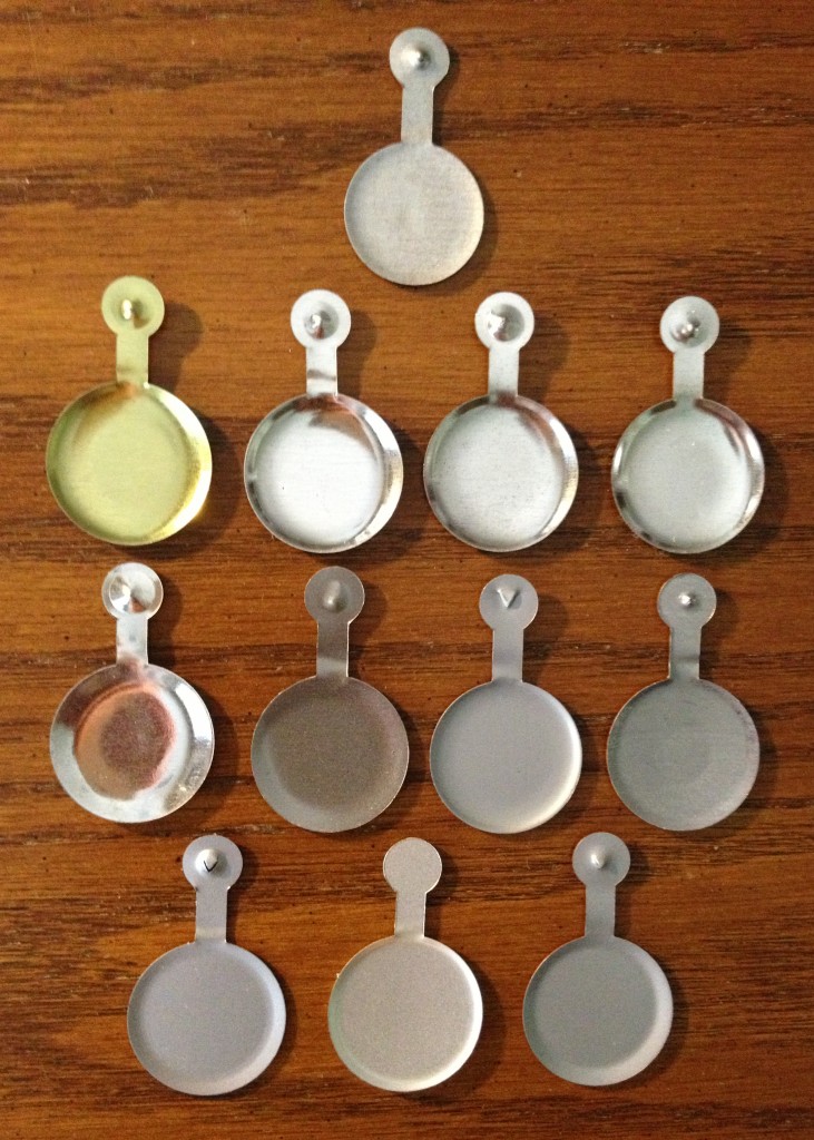
On Thursday of this week The New York TImes reported that the Metropolitan Museum of Art has decided, after 42 years, to stop issuing to each museum visitor one of its signature admission buttons. The colorful metal tags are being abandoned in favor of adhesive paper stickers. Cost is the reason.

The writers of the Times article anticipated my reaction: “In an era in which physical objects seem to be rapidly dematerializing into the digital, the loss of a durable little chunk of the Met will undoubtedly be missed.”

This sad news prompted me to dig out of my desk drawer some of the tags I’ve saved over the years.

.

.

.

For many, these are mementos to be saved and cherished. For a few, these objects will continue to form the basis for a collector’s hobby.  As is true when collecting objects — coins and stamps are prime examples — each individual Met badge, once acquired, becomes a piece of a larger puzzle — a puzzle whose solution leads the collector into history, technology, and design evolution. The matter of design includes material, shape, size, color, and image. The questions are endless. Just take a look at the photos of the front and back — no, let’s call them recto and verso — and ideas will pop into your head.  Why, for example, was it decided to extend the color of the disk to the stem of the current (final) design, the one featuring an “M”?  Why does the depth of the “frying pan” differ from tag to tag?

Even among my collection of a mere dozen pieces there are so many variants! I suspect among the millions of Met tags manufactured, there are many accidental variants as well — “errors” that tantalize the collector with the most coveted of attributes: rarity. Note in the second photo how the metal generally is a tin or steel gray color, except for one instance of a brass-like finish. How rare is that issuance? Even more exciting is the middle tag in the bottom row. Its unpierced stem meant this was a flawed badge, sure to fall off of the visitor’s lapel. How many of these are out there? Do I own the “Inverted Jenny” of Met badges?

Hundreds of folks have commented on the Times article, most of them nostalgically. But one of them — Alan Wright (NJ) — offers a warning aimed straight at me:

“The only thing more wasteful than those stupid metal pins is any time spent researching, writing, reading, and commenting on them.”

.

Dusk Over Glover Park

June 28th, 2013

.

I snapped this photo on June 16, 2013, at 8:48:22 pm, standing in the open field near the entrance to Glover Park at 39th and W Streets, NW, in Washington, DC. This was the view facing due north.

.

.