When an unsympathetic viewer confronts an abstract painting, an easy jest for him to declare is: “I can’t tell whether it’s hanging upside down or right side up!”
Uncertainty of that kind rarely arises when the art being looked at comes from the realist school. There are enough cues in a figurative piece to set the image aright.
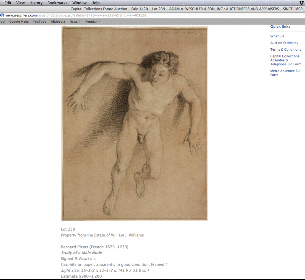
Last month, while looking through a catalog of paintings, drawings and prints up for auction at a local auction house, I found an exception. It was a case of someone — most likely the cataloguer who handled the photos of the art and arranged them on the catalog page — literally turning the artist’s intention upside down. The cause of the snafu is beyond my knowing; it may well have been a simple mistake by someone otherwise familiar with our visual heritage. But whatever the cause, in both the printed catalog and auction house’s online presentation, an eighteenth-century pencil drawing of a male figure was shown this way:
.

(Screenshot of online catalog, cropped)
.
It’s a fine drawing. The artist, a French engraver named Bernard Picart (1673-1733), demonstrates himself to be a skilled draftsman. Picart well qualifies for his own Wikipedia page, here. He is renowned for the book illustrations he produced for editions of the Bible, and Ovid’s fables for which he depicted scenes from Greek and Roman mythology.
What interested me in the drawing is the clues it reveals about Picart’s working methods. Here, I thought, is evidence that Picart used a live model as the source for initial studies that would ultimately become his final engravings. This was an example of the preliminary drawings he likely relied on to generate insights and solutions when composing a final picture.
But before speculating further there was another matter to address. Picart’s drawing was arranged on the catalog page in a way that placed the figure in a head up, feet down position, To me this looked, well, mighty awkward. There was something not right about the configuration of the man’s limbs, something strange in the outbound spray of his hair. Why, I wondered, wouldn’t the artist establish what his model’s feet are resting upon? What’s prompting the inexplicable sense of weightlessness to his stance? Surely the artist did not mean for the man to look as if he were pinned to the ceiling, wriggling like Spiderman. I suspected others who looked at the catalog also were momentarily confounded, unable to make sense of this human figure, uncertain of the purpose he was meant to serve.
What is the figure’s raison d’être?
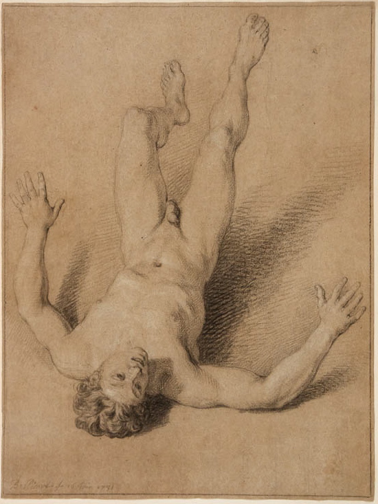
Ah! Might it look different if the figure were turned . . . upside down, head-over-heals, like this? —
.

.
Now we understand intuitively what’s happening. The figure is meant to signify a man in free fall, falling through space, unmoored from his body’s natural protections against gravity. His implied trajectory is as dramatic and as horrible as one can imagine. His arms splayed out like helpless wings, he will come to a terrible end. That is what Picart wanted to capture.
The artist could not very well ask his live model to remain freely suspended, head pointed downward, from the ceiling of the artist’s studio. Cleverly, like a modern-day photographer who place a model on an evenly lit stage, to stand on and in front of a stark white, smoothly-papered, shadow-free backdrop, Picart discovered an expedient. He would place his model in a supine position, his torso on a low stand, with his feet pressed up against a wall. He may well have used white drapery to make disappear these supports. This was a pose his model could assume with minimal discomfort. It allowed for easy changes in positions, various shifts to the head, arms, torso and legs, as the artist might choose to visualize. It well served the artist’s goal of capturing the falling look he needed.
Needed for what?
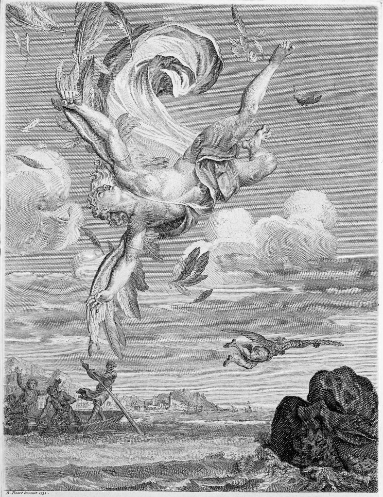
To reenact a narrative of a man’s fall that his contemporary audience would immediately recognize as the Fall of Icarus.
Below is Picart’s engraving, The Fall of Icarus, for which I believe the auctioned drawing was a preliminary study. The engraving is one of the illustrations Picart contributed to an edition of the Metamorphosis of Ovid published in 1733.
.

.
————————-
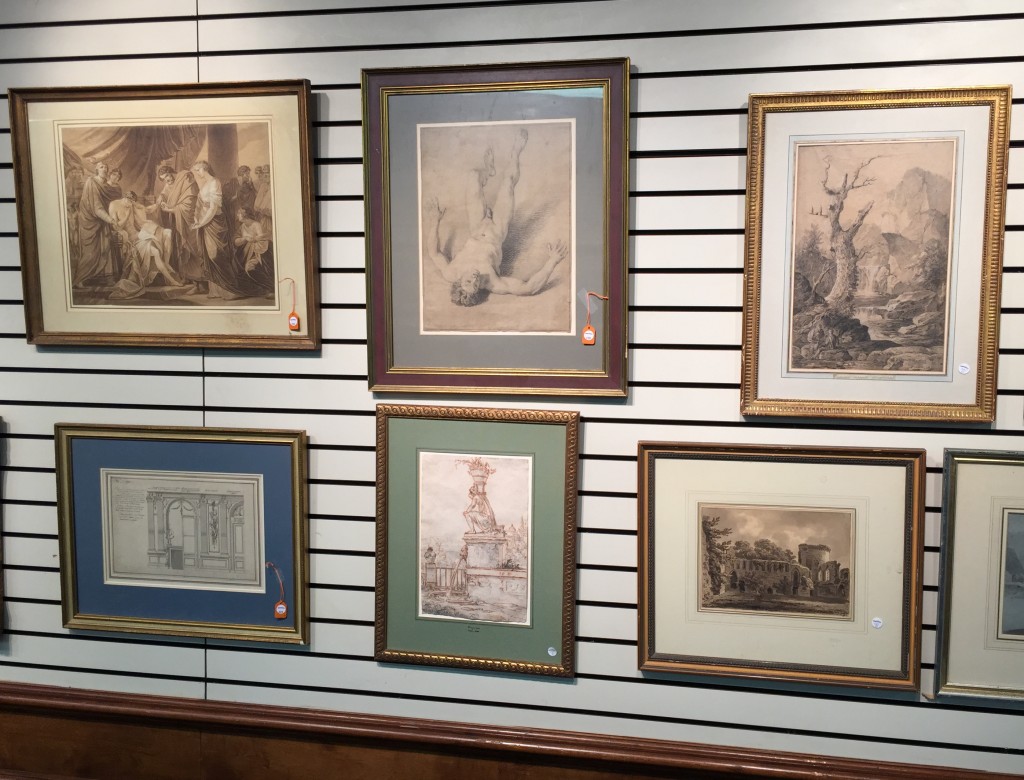
Note: The auction house correctly hung the framed drawing during the exhibition held during the week prior to the auction:
.

.

