In an office where I once worked there was a supervisor who had on his desk a custom-made sign. It faced you as you sat in the chair before him. The sign announced the supervisor’s personal and managerial philosophy, which was this:
“Dazzle Them With Bullshit.”
You get the picture — a boss from Dysfunctional Hell. The day he departed there arose from survivors a collective sigh of relief. Normalcy was restored. We could breath again.
The highest respect ought to be reserved for people who, when they make a mistake, are able to say the first three words in this reparative statement: “I messed up; I’ve done better in the past and I’ll do better in the future.” I think the ability to say those words aloud is a sign of health. We now have a President who’s strong enough to say those words, or words to that effect, when the occasion is fitting. See, for example, his reaction to problems encountered with Cabinet nominations: “I screwed up . . . this was my fault“). For this he deserves kudos. At the same time, in the business world we have more than a few leaders who can’t muster the courage to say those words, even when circumstances scream out for their expression. Should those men and women be met with ridicule and obloquy, or let slide? How are we to deal, individually or collectively, with persons in powerful positions who celebrate bullshit, who deny mistakes?
I thought of this after reading Daniel Lyons’ profile of advertising guru Peter Arnell in the April 6, 2009 edition of Newsweek. Prior to last week I’d never heard of Mr. Arnell, a man who prefers to be known as a “brand architect”. I’m sure he doesn’t know me from Adam. The only connection we have is Tropicana Orange Juice.
From Lyons’ article, which I recommend, you will take away a few things. The first is that Mr. Arnell is the person responsible for the redesign of Tropicana’s orange juice cartons, replacing iconic and consumer-friendly packaging with a new design that was swiftly and universally reviled by the consuming public. The second thing you learn is that Mr. Arnell is a graduate of the Dazzle Them With Bullshit School. Lyons writes: “I keep remembering something Arnell told me when we sat down to breakfast in New York. ‘It’s all bulls–t,’ he said. ‘A logo on a can of soda? Please. My life is bulls–t.”
The third revelation of the Newsweekarticle may or may not be surprising: Mr. Arnell is unapologetic.
The Tropicana rebranding project was a crash and burn failure. In February, the company announced it would reverse the makeover and revert to its tried and true packaging. The project cost Tropicana and it parent, PepsiCo, millions of wasted dollars (some say over $35 million), not to mention the loss of accumulated good will of consumers turned off by the new look. Of such scope was the fiasco that it will be taught as as a cautionary case study in business schools for years to come. Arnell does not concede a mistake. He says he doesn’t understand exactly why his work was ultimately rejected by Tropicana. He appears to blame bloggers — I kid you not — for sabotaging the project. More likely he does know why and is simply unable to voice those first three words, “I messed up.” Even when he could legitimately follow that reality check with a reminder that he’s done good work in the past and hopes to do more in the future.
This afternoon I took a photo of some cartons of Tropicana OJ on the shelf of a nearby supermarket. It shows we are halfway back to normal. (Note 1: the hypnotic, film noir look is due to my cell phone camera capturing the “striped” waves of fluorescent store lighting. Note 2: I bought the two cartons on the right).
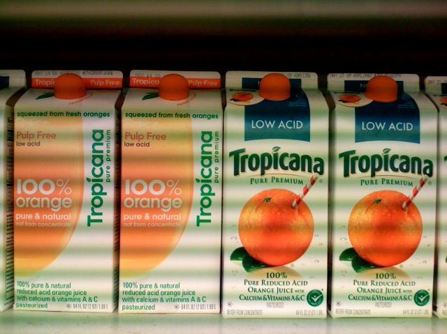
Soon, the two cartons on the left will be purchased, their contents consumed, and their packaging recycled and reused as something else. So this is a ripe moment to draft a post-mortem, even though I am late to the table. Many, many others have expressed their views, as summarized here and as reported in The New York Times, here. Let me begin with the question, what exactly was wrong with Arnell’s design? My answer is, many things.
1. The “Can’t See the Forest” phenomenon. Arnell and the folks at Tropicana who cheered on the redesign (you imagine a meeting when they all enthused, in group-think unison, “Pure genius! We love it!”) forgot a key point. A consumer’s first impression of a new version of a commonly purchased product occurs when he sees it on the supermarket store shelf. In the case of OJ, cartons of different varieties are presented as a packed mass of objects on several shelves. The begetters of this fiasco — and especially Arnell — fixated on the single object. Oops! The introduction of New Tropicana was not akin to July 2007 when someone showed you the iPhone they just got, and you delighted in its design excellence as you held it in your hands. No, the the first time I and most everyone else saw the new box was while standing in front of the refrigerated juice section of a supermarket. Arnell and his client also forgot that they had no way to wipe from consumers’ memories their fond attachment to the classic design they had been buying (in my case, had long been buying). Finally, they forgot that during the transition to the new design, there would be days, as stores were restocked, when shelves would contain both old and new designs, literally side by side, allowing for direct comparison and preference expression. Once the transition was completed, here’s what I and other consumers saw (photo taken several weeks ago):
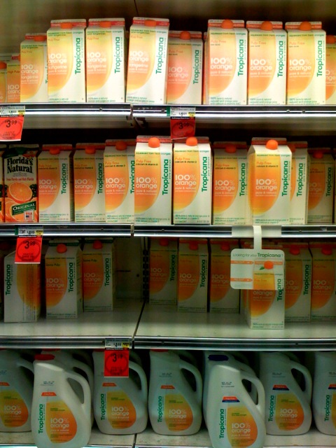
Tropicana occupies a large space. Dozens of cartons face the consumer, in row after row. I remember I was confused. “What’s happened?” I asked myself. A clot of other customers was milling about too, similarly confused, although I think if you were to have drawn “thought bubbles” over their heads, theirs would have shown an angry “WTF??” (this supermarket draws many students from a nearby university). When massed, I thought the new containers looked cheap, especially since the Tropicana real estate was bordered, left and right, by the cartons of competitors (Minute Maid, anyone?) who still had more pleasing, traditional designs. Of practical importance, all the varieties now looked the same (previously, varieties were clearly identified below the cap in a color-coded field, such as blue for Low Acid). In that mass of bland boxes how can you spot your particular preference and quickly go on your way?
2. The redesigned tree. As a stand-alone object, the carton also fails miserably. Its character is industrial (contradicting the healthy, organic vibe juice should impart). It is minimalist (an IKEA-like style most Americans read as “cheap,” “discount,” or “generic” and not worth the premium price Tropicana exacts). It is consciously manipulative (especially in that off-putting, vertically-aligned, sans serifs, “Tropicana” — you wonder, am I in a library where we’re forced to read the spines of books by cocking our heads the right? Why, dammit, when the carton is plenty wide for all necessary text to be horizontal?). The new design is thin and cold (compare the rich warm orange tones in the iconic design; it’s as if the juice in Arnell’s carton has been watered down to a paler orange, an unattractive dilution). It is hard to read (the consumer wants to locate her favorite variety of Tropicana without stumbling; notice the easily spotted variety name on the classic design and compare it to the redesign in which text disappears into a game of “hide-the-ball” [hint: “low acid” appears in tiny type on the left side, beneath the words “Pulp Free”]). It is, in short, too consciously design-driven (which American consumers generally read as arrogant) It’s as if Tropicana intended to market its product as Juice for Mac Lovers.
3. I’m a genius, you’re a Philistine, now pay me homage. Additional stumbles lay at the “design arrogance” doorstep. One is how the designer’s affectation for lower case letters trumps user friendliness, such as when seven easy-to-spot capitalized letters (LOW ACID) are replaced with seven hard-to-find lower case letters, telling the seeker of that special product how little respect Tropicana has for his needs. You’re in my control, you picky unlettered consumer. Another example is the problematic orange colored shape. It’s not easy to “read.” Is it just a shape? A distended bladder? A spill of juice? The answer arrives only when you take the carton and rotate it. Voila! It’s a juice glass. Now this, of course, is very clever. Very interactive. It displays the designer’s playfulness, his desire to think outside the box, or more precisely, outside the front plane of a four-sided carton; his rebellion against the tyranny of frontality; his need to sculpt. But for those consumers not majoring in art or design, this comes off not as clever, but as “clever.” It is something that in no way assists us as consumers. We don’t feel better knowing that Mr. Arnell has found a way to conquer the tyranny of frontality, the constraints of the flat picture plane. We’re buying OJ, not a Rauschenberg. Look again at those cartons wedged on the shelf. They are not ready to rotate. The full image of a juice glass remains hidden, out of sight. Come to think of it, if you wanted to play with half-revealed images, with a puzzle that requires two pieces for completion, then why not work within the constraint of side-by-side shelf placement, why not print the orange half glass on the right side of some cartons and on the left side of others, so that shelf stockers could play at completing the pictures down the rows, so that consumers would see a chorus line of couples? Then the wit would be less onanistic, more consumer interactive. (Dear Tropicana, For $35M I’ll explain my design plan in an exhaustive Arnellesque memo.)
Had PepsiCo’s executives paused to think at an earlier phase prior to the expensive roll-out; had Tropicana’s marketers placed mock-ups of their proposed redesigned cartons at a typical point of sale — in situ — in a supermarket where folks actually interact with the product; had they observed the negative reactions of loyal customers; had they seen people’s frustration at not being able to find their favorite type of Tropicana — then surely they would have caught these flaws and nixed the plan.
All of this points to questions that ought to be raised from the floor at the next Pepsico Shareholders Meeting: What was the nature and extent of the “market research” that you say supported greenlighting this fiasco? How much did this mistake cost us? Specifically, what was the cost of the roll-out; the cost of the recission; the cost in sales lost to competitors? What were you — the business leaders of the company we shareholders own — thinking?
