.
.
(Tip of the hat to JWE)
The Jeff Koons retrospective opened at the Whitney Museum this week. Positive reactions were expressed by our two smartest art critics — Peter Schjeldahl (“Approaching the work with eyes and mind open, you encounter Koons’s formidable aesthetic intelligence”) and Jerry Saltz (“One can’t think of the last 30 years in art without thinking of Koons, a lot.”).
I haven’t been to the show (yet) but I have seen many of the artist’s signature pieces in person (starting years ago with a Basketball Total Equilibrium Tank at the Chicago Art Institute). In the series of works he’s created since then, Koons has been able, more often than not, to communicate his vision convincingly enough that I begin to see the world through his eyes, however briefly. (This is one test by which to judge the success of an artist.)
In her review of the Whitney exhibition, Roberta Smith reminds us that in the world of Koons you often come across a “collision” of art with religion, or sex, or kitsch. Examples from the kitsch category include:
.
.
.
.
.
While reading a magazine today I came across the new advertising campaign for the Toyota RAV4. It features a huge pink unicorn/Pegasus riding atop the vehicle.
.
.
A television commercial of the same subject (“Lady the Unicorn”) can be viewed here. A still from that TV spot:
.
.
It is a vision out of the mind of Koons, don’t you agree?
If the campaign’s art director was channeling Mr. Koons, the copywriter was in sync as well. A habit of Koons that drives interviewers, especially grumpy ones, batty, is his penchant for childlike, bright-eyed and affirmative utterances. Jerry Saltz refers to them as Koons’ “Twinkie-like quotes.” For example, when asked what he felt as the 150+ pieces were being installed throughout the Whitney Museum, Koons replied, “I’m enjoying every moment of this. I enjoy it because I really believe in art, I really believe in the transcendence that it’s given me. It’s taught me how to feel, to enjoy the senses, and … it’s taught me how to enjoy ideas and also experiences, a very ethereal, ephemeral realm of ideas.” Similarly, in an interview last year Koons enthused: “Every day I wake up and I really try to pinch myself to take advantage of today and to use that freedom of gesture to do what I really like to do.”
So what is Toyota’s ad-friendly restatement of Koons’ cheery sentiment?
“Let’s make today fun!”
.
.
The human interest story that’s headlining the news this morning is a nightclub fire in Santa Maria, Brazil. Several hundred persons are dead.
Whenever there is a tragedy of this magnitude it is the sad but necessary duty of journalism to converge on a single photo to illustrate the event. In this event the media quickly anointed a picture with iconic status (attribution: Germano Rorato/Agencia RBS, via European Pressphoto Agency (EPA); AP; and Reuters).
.
.
It is a photo taken on the street outside the club, showing fire trucks and rescue workers and other people milling about. The night sky is hazy, and we correctly read this not as mist but as smoke from the nearby fire. Here is how the photo is presented on the website of the Daily Mail.
.
.
The same picture, but this time in a cropped version, can be seen on the website of The New York Times.
.
.
Someone, presumably an editor at the NYT, chose to zoom in on the central tableau, cropping the photo’s left side, eliminating our view of the sidewalk and pedestrians, setting aside the direct glare of the overhead street light, and also trimming the remaining three borders. The reason for this is not hard to understand and appreciate. The focus of the scene, and what must have caught the photographer’s eye, is an anguished man carrying the prostrate body of a victim. Their vertical and horizontal forms create a cross, the pose of a Pieta. Although it is important for the record — for context, for history — to note that this picture is a detail of a slightly broader perspective captured by the photographer, Germano Rorato, I don’t think anyone can argue against this being a legitimate editorial choice. The fact that the picture’s composition arguably has been improved is not as important as this key observation: the reality of the moment remains undisturbed.
Other media outlets covering the tragedy apparently felt the original photo, in its entirety or cropped to its central focus, was not quite — how to put this? — not quite hellish enough. And so, at some stage in the chain of custody the photo was altered. There was some person or persons associated with the profession of journalism who made a decision to pump up the horror and pass their altered version off on the public at large. How? Easy.
Pretend you’re the lighting director at the Grand Guignol. Throw some switches and wash the scene with lurid red. There, that does the trick.
Here’s how the photo appeared this morning on the Huffington Post, the Drudge Report, and the Washington Post.
.
.
.
.
There’s a phrase used in the media to advise against imitating a dangerous activity: “Don’t try this at home!” Yet on this occasion, in this heyday of digital manipulation, the keys to altered reality are not in the exclusive possession of the media. You can try this at home, under safe conditions. Just fire up your favorite photoshopping tool and, after just a few adjustments — Voilà! — you’ve successfully followed the lead of journalists into Hades.
In the example below, I started with the photo as cropped by The New York Times. I color-adjusted it in the crudest way possible on three scales: I increased Saturation to 100 from 50, raised the Temperature to 100 from zero, and shifted Tint all the way left to red.
.
.
.
UPDATE 02-03-2013
An artificially pumped-up hellish version of the photo (an expert’s manipulation finer than my effort) has become the officially archived memento of the event in The Daily Beast‘s gallery slideshow of “Deadly Nightclub Fires“:
.
.
Oh, what the hell, let me try to match it, once again using as a starting point the cropped original photo that appeared in the NYT, then playing with Exposure, Contrast, Saturation, and Reduce Noise. How about this?
.
.
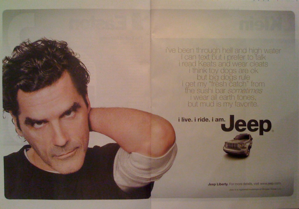
The first six words in the title of this post — if you count each un-capitalized “i” as a word — is the tagline of a new advertising campaign for Jeep vehicles. The campaign’s 30-second TV commercials have not been well received by media observers. See, for example, comments here, here, and here. Jeep is also placing “i live, i ride, i am” advertisements in magazines, and in my opinion these are truly, madly, deeply, bad. I’m talking about text so awful it defies parody. Here is a two-page spread in the December 14, 2009 edition of TIME magazine (pages 34-35):
.

.
The words that appear in faint gray type in the upper right quadrant — the text providing the premise for the punchy tagline — reads as follows:
i’ve been through hell and high water
i can text but prefer to talk
i read Keats and wear cleats
i think toy dogs are ok
but big dogs rule
i get my “fresh catch” from
the sushi bar sometimes
i wear all earth tones,
but mud is my favorite.
Yes, those lower-case “i”s are indigenous to the copy. It wouldn’t surprise me if a phalanx of Apple attorneys were suspiciously eyeing those “i”s. It also wouldn’t surprise me if those same lawyers offer Chrysler, in lieu of crippling litigation, a friendly settlement proposal calling for minor changes in the tag line:
i live. i ride. i phone. i pod. i mac. i am.
But for now let’s give credit where credit is due. It was the Mad Men at Jeep’s advertising firm who came up with the idea of eschewing margins in favor of pseudo-poetically centering each of the nine descriptive lines. And it was their idea to italicize the word sometimes — a nuance sure to render many a reader weak-kneed.
I confess I was puzzled, however, to find the bold lack of punctuation surrendering to convention just when the statement reaches its final two lines. It’s as if the copywriter, almost done with the task, was suddenly touched by the ghost of her tenth grade English teacher, who whispered a plea: A comma and a period, please!
On the other hand, who among us can resist forming a wry smile at the rhyming of Keats with cleats? Clever.
As for the trendy sentiments expressed in the ad, yes, they’re sophomoric. But so what? (The visiting ghost came from the tenth grade, remember?) Maybe the whole thing is an homage to the malarkey found in the Manifesto of Thompson Hotels?
But enough about words. The bigger oddity is the photo in the left panel of the ad. This, presumably, is the Keatsian survivor of the fabled watery hell (or was it hellish waters?). This is a man who does not know for sure whether tonight’s dinner will include sushi. Can you blame him for scowling at us? Of course not.
But I wonder: Why was he asked to take a pose that is in-your-face and awkward, macho and goofy? Hey, I know the arm swing’s a guy thing; I do it too. But here’s the risk: Someone will be tempted to suggest this guy’s next gig ought to be on stage playing opposite Katisha (She: “My right elbow has a fascination that few can resist.” He: “Ditto my left, baby.”)
Is it just me, or do you also find the more you stare at the picture the more his bare forearm looks like a raw turkey drumstick attached to his left ear? (OK, maybe it’s just too close to Thanksgiving for me.) Whether it be a drumstick or an arm, the fact is the thing’s projecting forward from pictorial space, and none too elegantly. As artists will testify, foreshortening can be a bitch. See, for example, Durer’s posthumously published treatise, De Symmetria. So why did the creator of the ad go there, and why compound the problem by featuring a limb that’s freakishly fingerless?
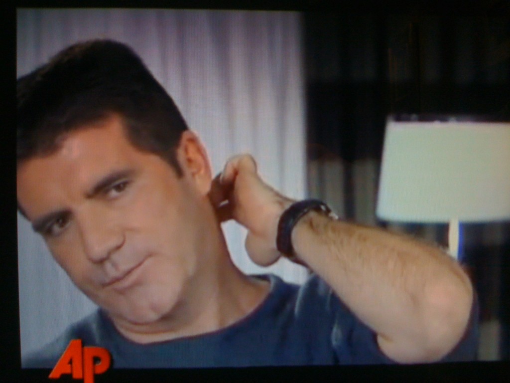
At least when we watch Simon Cowell’s bad habit of scratching the back of his neck, we see him in motion (as in this video at 1:41 – 1:43) and we get to see his hand, as shown in this screen shot:
.

.
[As for the title of this post, if you want to read more about “i yi yi” (aka, “Aye Yi Yi”), an expression used to show frustration, hopelessness, sadness, annoyance, click here and here.]