Archive for the ‘Culture’ Category

Quote for the Week . . . and a Spammer’s Joke

Sunday, October 18th, 2009

From an article in The Wilson Quarterly, online here, comes this observation by Tyler Cowen:

“The measure of cultural literacy today is not whether you can ‘read’ all the symbols in a Rubens painting but whether you can operate an iPhone or other web-related technologies.”

. . .

In recent days this blog has received a spate of comments from spammers fronting for online “pharmacies” (if you know what I mean). Each message begins by recounting a joke (to lower your defenses?). I thought one of the jokes was good enough to repeat here.  It’s in the child-pleasing Q&A format and goes like this:

“What happens to illegally parked frogs?”

“They get toad away.”

.

Separated . . . by time and space

Friday, July 24th, 2009

“Separated at Birth?” — that is the title of a game described by Wikipedia as the light-hearted activity of pointing out people who are unrelated but bear a notable facial resemblance. Most often the subjects compared are celebrities.

I was reminded of this when, having finished the first chapter of Jonah Lehrer’s “Proust was a Neuroscientist,” I set the book aside and in the process took notice of the author’s publicity photo on the book jacket. Something about the picture caused a buzz in my brain. What was it?

This:

Intentionally or not, when composing and lighting the shot, the photographer, Guy Jarvis, captured a look similar to that of Vermeer’s Girl with a Pearl Earring.

Jonah Lehrer and the unknown young woman could be distant cousins, separated by an ocean and three and a half centuries.

blog-1

blog-3-vermeer-girl-with-pearl

________________________________________________________

blog-4-vermeer-girl-with-pearl-detail1

blog-3-jonah-lehrer-detail2

________________________________________________________

No, General, I won’t fund your culture war

Saturday, July 18th, 2009

Yesterday’s mail brought a fundraising letter from Lt. Gen. Josiah Bunting, III, a man of great distinction.  Bunting asks for money on behalf of the Intercollegiate Studies Institute (ISI), a component of which, the Lehrman American Studies Center, he serves as President.  The letter bothers me for four reasons.

1.  Who’s there?

The unsolicited letter is written in a manner that’s sure to annoy more than a few recipients, and I wonder why ISI didn’t assign someone with the right skills to edit it, if only to sand down its grating style.  Given Bunting’s long career as a writer, scholar, and educator, it’s hard for me to believe that he drafted, edited and finalized the document.  Which is to say that when, in the paragraphs that follow, I indicate that “Bunting writes …” or “According to Bunting …”,  I sincerely hope I’m wrong and that the text I’m citing is not in fact conveying his voice, his temperament and his knowledge, but instead is content furnished by ISI and anonymous staffers. 

2.  The familiarity ploy

Before the letter launches into histrionic mode (more about that, below), Bunting warmly addresses me as “Dear Friend,” and soon thereafter as “My friend.”  Now, I swear I don’t know him from Adam, yet he says he knows me.   An ersatz friendly tone is often found in charity fundraising letters, of course, following a template pushed by consultants.  But Bunting says I (along with thousands of others who received the same letter) deserve a bear hug for good reason:

Your name has been given to me as a steadfast supporter of the preservation of America’s founding principles; a steward of freedom who cares deeply about the future of our nation.

Is he channelling Eddie Haskell or what?  And yet, unctuousness aside, who am I to quibble with this glowing description of me?  But, on the matter of familiarity, wouldn’t it be nicer, I’m thinking, to receive an unsolicited letter that displays honesty and humility?  And for a model I turn to an uneducated fourteen year old named Huckleberry Finn, who, in his own overture to readers, in his very first words, confesses:

You don’t know about me . . . 

So, anyway, I decided to dig deeper into the letter.  And that’s when I came upon a creepy come-on, as I’ll describe next. 

3.  Questionable command of English

Here is the third sentence of the letter:

As a true American patriot, I know you are concerned about the direction of America’s colleges and universities.

Well.  One thing I am a true believer in is English grammar and clear writing (while, Lord knows, I mess up all the time).  A rule students learn in high school and are expected to obey in college and beyond is that a modifier (“a true American patriot”) should be placed as close as possible to the word it modifies (“you”).  Although there are colloquial exceptions to the rule (in spoken English), the rule should be followed if there is a risk of confusion due to the presence of more than one noun/pronoun the modifier could be describing (here, both “you” and “I” are candidates).  Bunting himself is half a century removed from his undergraduate degree in English, but rules are rules, and clear writing is timeless.  If ISI truly intends to flatter the reader, or even if it’s just a ploy, the drafter should consider this formulation:

As a true American patriot, you are undoubtedly concerned about the direction of America’s colleges and universities.  

The thought I resist is that the Lt. General is trumpeting his honorable military service and combining it with a boast of uncanny power to discern like-mindedness in others:

I, as a true American patriot, know you too are concerned about the direction of America’s colleges and universities.

In its original state the letter gives the impression of being either a slap-dash effort or a crude stage for chauvinism — a terrible irony in a letter requesting money to support improving higher education. 

On to page two, where this plea pops up:

But, who’s going to climb a hill for others if their hearts are bitter towards their own culture?

Something is not right.  The word “who” can be singular or plural.  In this sentence it appears to be plural, referring to persons (plural) who possess hearts (plural).  But the word “who’s” is a contraction of “who is,” a misplaced singular.  The sentence needs not an “is” but the plural verb “are.”  Or, in the alternative, the simultaneously singular- and plural-fitting verb “will” will do the trick, as in the sentence, “But, who will climb a hill for others …”  Yet another possible reading of the sentence is that the author meant for the cited “hearts” to belong to the “others” for whom the single hill-climber is making a sacrifice.  But this makes no sense in the context of Bunting’s argument, which is that young persons must be inculcated with unquestioned love of country (we must “nurture the next generation of patriots”), for if we do not, we will fail to produce  citizens able to meet the demands of inevitable wars.  Then again, the letter’s expository prose is so muddy at times that the reader may be unavoidably flummoxed.  

In the first of his two post-scripts on page four, Bunting proudly informs us ISI’s charter says the organization’s headquarters “cannot be in the nation’s capitol.”  Well, of course not.  The word “capitol” (with an “O”) always refers to a building.  Watch the cute video, here, on this point.  The building housing our nation’s legislative branch is the U.S. Capitol.  It was Thomas Jefferson who insisted the legislative building be called “the Capitol.”  

us-capitol-building-west-face


It’s a large building, to be sure, but it would be the height of arrogance for ISI to think it had a chance of being located inside the nation’s capitol.  In contrast, “capital”  (with an “A” as the final vowel) refers to the District (see Article One, Section 8 of the U.S. Constitution) within which the federal government, and many a non-governmental organization, reside.  The same capitol-versus-capital distinction applies at the state level.  With this error, ISI, which sponsors the National Civic Literacy Board, earns a bonus point for irony.

Let me stop there, and express the hope that an intern with serious skills is hired to scrub through the next ISI letter prior to its release.  

4.  The culture war is here for you to join

What galls me is this:  ISI’s presumption that I am on its side.  I’m not speaking of the “side” in favor of improving classical education while strengthening all Americans’ understanding of our country’s long history and our nation’s uniqueness.  On that ground I have my feet firmly planted, thanks to a superb liberal arts education.  As a student of political science and history, and as a current participant in government, my mind and heart are there too.  No, I’m referring to the  letter writer’s assumption that I stand on his “side” in a great cultural war the far right desires to foment. 

The letter is very clear on this point:  the reader will be judged to be either “upholding the principles of the Founders” (values to be defined by . . . the Lt. General?) or found unworthy of  “confidence.”  For now, at least, I’m in Bunting’s good graces; he reports I have been tested and, in his words, “You have proven your dedication to the values upon which this country was built.”  (Should I keep a copy of that certification in my wallet, in case I need it to pass through check-points, come the revolution?)

Presumptuous? Arrogant? Scary undertones of Big Brother?  You betcha!  The  four page letter is chock full of radical right code words, phrases, and bêtes noires.  An ideological slant is never far from the surface, and frequently bursts through.  ISI says the American university system is being poisoned by a toxic culture.  Students are paralyzed by revisionist liberals.  A cadre of apologists (a term the letter neither defines nor assigns to named individuals) have made it their life’s work to disconnect our young people from the values and institutions that sustain a free and humane society.  Moreover, if we do not act, the anti-freedom crowd will gain the upper hand in the fight for our future leaders’ hearts and minds.  The letter closes with a statement that would fit nicely into a ritual session of Two Minutes Hate:

It is our job to expose them and I am counting on Americans like you to help us educate for liberty. 

I am struck by what is absent from the text.  Nowhere in four full pages addressing  American principles does the word democracy (or any of its variants) appear.  It seems Bunting believes the “nation’s heritage” ended before 1800, and so nowhere is there an appreciation of two centuries of subsequent history — a history forged by American people of faith and courage and intelligence equal to (or in the case of religious faith, exceeding) that of the leaders who emerged during the period of armed Revolution.  The letter displays a fetishistic attachment to the Founding Fathers, to the exclusion of our grandly successful, ongoing American experiment.  When describing today’s youth, Bunting casually tosses off calumnies (“their hearts are bitter towards their own culture”).  These are the words of a curmudgeon blind to the actual lives and character of young Americans.  (Say it ain’t so, Joe!)

I believe the study of history, which Bunting says he supports, shows America to be an unfinished nation.  Our nation is still being created.  This idea scares many people, I know.  Many prefer the sclerotic over the dynamic.  But the rest of us — and I believe we are the democratic (small “d”) majority — must steadfastly guard against the baleful consequences that would flow if personal fears prevailed.  That is the true threat to our lives, our liberties, and our happiness.

Whenever I encounter someone arguing that the America they live in today is not the country of their youth, let alone the country as founded over two centuries ago, I’m reminded of W. S. Gilbert’s lines satirizing a particularly sorry fellow:  “The idiot who praises with enthusiastic tone, all centuries but this, and every country but his own.”   As with us all, time’s fell hand ultimately will sweep them from the scene. 

I am struck by the aging of persons prominantly embracing a Manichean world view.  I’m noticing, for example, how Pat Buchanan is becoming unsteady in his argumentation.  Just this week he asserted, erroneously, that no blacks fought and died in the Vicksburg campaign (video, here; historical facts, here and here).  Sadly, the reason Buchanan denies history is so he can argue white males have a superior claim of ownership of America, de facto (long exclusive possession) if not de jure.  Also this week, in a different forum, Buchanan misquoted the Preamble to the U.S. Constitution in support of a related wacky argument, to the effect that the progeny of the Founding Fathers (white males) are the legitimate inheritors of a nation “created” back in 1787. 

All of which goes to show, some folks way past their college years need remedial education in this nation’s history.

Walter Cronkite (1916-2009) – An Appreciation

Saturday, July 18th, 2009

Everyone watched the CBS Evening News with Walter Cronkite. 

To read the name of that essential program, to recall the announcer’s voice that introduced it (“THIS IS the CBS Evening News with Walter Cronkite”), is to realize how fitting those few words were.  In the 1960’s and 70’s the news came to us with, and through, Walter Cronkite.  And because of who he was, an essential civic function was carried out in a manner at once graceful, authoritative, and mature.  Cronkite will never be duplicated by any other broadcaster. 

I remember him, in his early retirement years, serving as Master of Ceremonies for the initial Kennedy Center Honors programs celebrating outstanding achievement in the Performing Arts.  And, let’s be frank, who among us didn’t wish, every time we saw him in those years, for him to lead a Restoration, to return to the news anchor desk and restore class and professionalism to the field.  Who can deny that, post-Cronkite, TV journalism has been on a downhill slide that continues to this day.  

I remember the Kennedy assassination broadcast in 1963.  I remember the magnetic pull of our black and white TV, those three terrible dark days.  It was another twenty-five year before I next saw those minutes of Cronkite’s choked announcement, a man pulling off his glasses to look up at a clock so he could add reportorial precision, factness, to devastating emotion.  Twenty-five years later I was visiting the museum at the Texas School Book Depository in Dallas.  The exhibition space leads visitors in a meandering path until you hear Cronkite’s broadcasting voice, which draws you to turn a corner and see, on a monitor, him delivering the fatal news.  As I expected, this brought the adult me to tears (while on screen Cronkite regained his composure), and I felt embarrassed, surrounded as I was by a class of high school kids on a field trip, for whom this all meant next to nothing.

In 1967, as a faithful nightly viewer, I remember Cronkite announcing each week the casualty figures of the Vietnam War, and how those numbers climbed steadily into the hundreds, week after week, until the repetitive and cumulative effect of death’s ostinato wore all of us down.  Then one evening came the pricking of the boil:  Cronkite, out-of-character, pronounced the war simply not winnable.  In that extraordinary and necessary departure from routine, he shocked us awake, and changed history. 

Most of all I remember his hosting live daytime News Specials on the occasion of the launching of each Mercury, Gemini, and Apollo mission.  He played with model capsules along with his guest astronaut pals.  He demonstrated docking maneuvers.  He deftly took the role of the nation’s educator, called on Wernher von Braun to explain why a certain plan was being followed  rather than some other.  Then, after years in the making, this careful series of steps culminated in his ultimate joy, a joy sweetly child-like coming from a man with a serious senior body and beautiful Midwestern voice.  The triumph of the 1969 lunar landing.  At that moment, as at other moments, his was the breathing and his was the voice, of America.

Cronkite was the embodiment of the  principle that if you chart and follow a course that is steady, constant, and controlled, you are likely to achieve success.

For some reason I remember one other out-of-character event — the time he addressed us in the TV audience upon his return to the anchor desk after a summer vacation spent sailing.  If I recall this correctly, he actually was into his third or fourth broadcast of the week of his return to the air.  I’m talking about the time he revealed to us why his hair looked different; it had turned reddish from the sun, he explained.  Though my memory may be faulty, I don’t think I’m making this up.  The reason I remember this is, of course, because like millions of others, I had come to think of Cronkite as a member of the family, a substitute father, or as he was commonly known, Uncle Walter.  That was a rare moment when he thought he owed us something more than simply being, night after night, the epitome of professionalism. 

We now know it is all of us who owe him so much.

James A. Jefferys, American Painter (1889-1969)

Friday, May 15th, 2009

In the preface to his book of essays, “L’Envers et L’Endroit” (“The Wrong Side and the Right Side,” 1958), Albert Camus wrote:

I know this with sure and certain knowledge: a man’s work is nothing but this slow trek to rediscover, through the detours of art, those two or three great and simple images in whose presence his heart first opened.

Most people cannot claim the mantle of artist. Still, most of us face the same urge to recapture early joys. This is sometimes disparagingly referred to as “reliving your childhood.” You see it at baseball games, where old men sit in the stands vicariously joining in the play on the field. You see it when a new mother selects a first doll for her daughter. You saw it last year when many Americans who, 40 years before, had joined Robert F. Kennedy in his improbable and sadly aborted 100-day quest for the Presidency, found themselves rejuvenated by another political campaign powered by hope and renewal.

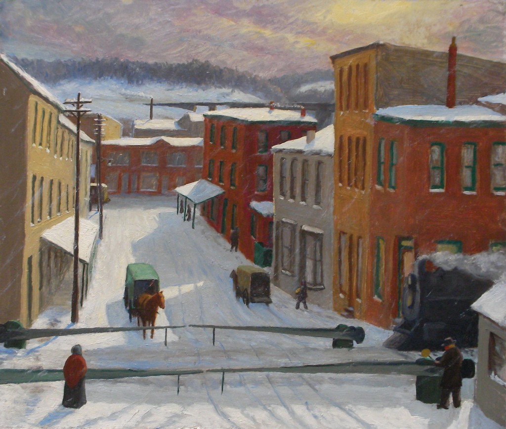
I love snow for a simple reason: it instantly transports me back to childhood. To capture that feeling and make it available in every season, I collect art depicting snow in the city. One of the pieces in my collection is this 10-by-12 inch oil sketch, “Drifting Snow,” dated 1910, of an intersection in Philadelphia:

James A. Jefferys, Drifting Snow, Manayunk, 1910

The artist, James A. Jefferys, lived in the city’s Manayunk neighborhood. He indicated the scene’s location in a hand-written inscription on the verso: “Drifting Snow. Sketched from 2nd floor front Room of H.D. Richards showing R.R. Gate Tender at Cresson & Short Leverings St Manayunk Phila 2-14-1910 By James A. Jefferys [?]20 Grape St”. To 21st century eyes, the picture’s most interesting detail may be the train engine entering from the right. There’s something odd about this vision of a train encroaching on an urban streetscape normally reserved for less daunting vehicles. It puts me in a surrealistic mood. I’m ready to imagine the train’s next stop is someone’s living room, as recorded in Magritte’s painting, “Time Transfixed.”

Historical notes: In 1929-1930, Reading Railroad replaced the Cresson Street train tracks with an elevated structure. The name Manayunk is derived from the Lenape Indian word “manaiung“, which means “river” or “where we go for drink.” Manayunk is an old blue-collar industrial neighborhood (textile and paper mills thrived in the 19th century) currently undergoing gentrification. It rises from the banks of the Schuylkill upriver from Wissahicken Creek, a few miles from center-city Philadelphia.

As for the artist, a Google search uncovered only sparse information about James Jefferys’ presence in Manayunk. Geneology sites contain references that supply birth and death dates of 1889-1969 and show his continual presence in Philadelphia (interrupted by service in World War I).  Yet I’ve found nothing about his activity as a painter; no records of his artistic training, exhibitions, or awards.  Possibly he was a self-taught artist.  The 1910 painting shows a careful but tentative hand of a novice painter (he was only 21 at the time) uninfluenced by academic training. He kept painting, though. Possibly he worked in a related field such as sign-making, illustration, advertising or publishing. This early sketch reveals an intuitive sense of atmosphere and color. To my taste the painting is pleasing and very American.

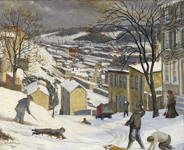
Three years after buying the snow sketch I came across, at auction, another painting by Jefferys that I thought would be a fine addition to the collection. I was happy to place the winning bid for this 1938 oil on canvas:

J.A. Jefferys, "Boone & Grape Sts., Manayunk"

[Boone and Grape Streets, Manayunk, oil on canvas, 1938, 20 x 24 inches, signed and dated lower left recto; inscribed on verso: “Boone & Grape Sts / J.A. Jefferys / 4310 Terrace ST / Myk PA”.  Rago Arts and Auction Center, Lambertville, NJ, Fine Art Auction, May 15, 2008, Lot 226.]

Jefferys’ note on the verso of the smaller snow scene, done nearly three decades before this painting, placed his residence somewhere on Grape Street. This means he would have been very familiar with the street’s trecherous upper reaches, depicted here. The Terrace Street address  listed on the back of the 1938 work places him just two short blocks from Boone and Grape. I imagine him walking out the front door of his modest row house one cold day during the Great Depression, turning left up Terrace Street. A few steps into his trek he thinks twice about whether to take a detour down the steep Cotton Street steps leading directly to Boone.  He decides to keep on the safer sidewalk, on up to Grape Street, where he turns left to make the final trudge downhill to the intersection at Boone. There, in front of him, is a scene of immediate activity and distant calm. He is glad to have come upon something demanding to be captured on canvas.

What were Jefferys’ working methods as an artist? Did he do a pencil sketch then and there? Did he bring a camera? Or did he leave the house carrying a fresh canvas, easel, and plein air materials, instinctively knowing this would be a productive day?

If you stand at the same vantage point today, as you can do in absentia thanks to Google Maps Street View, it is clear Jefferys took some liberties with distant perspective, bending space to create a more thrilling atmosphere. That is what artists do.

Repeating elements seen in his 1910 sketch, the upper portion of the picture features mills and factories, the soft hills beyond the river, and finally a spacious wintry gray sky. But Jefferys’  talents have moved well beyond the primitive mode of 1910, now embracing a style similar to that of John Sloan and of a younger cohort of social realist painters who emerged in the 1930s. He has well captured in paint a landscape cushioned in white, the cold air alive. He introduces a stronger narrative. The foreground tableau is a tale of play and toil, where boys’ shouts compete with the muffled metalic scraping  of shovels handled by the old man at left and old woman at right. Tiresome work is consigned to the margins, peripheral to the central energy of sledders, who evade a snowball fight and zoom like dare-devils deeper into the world.

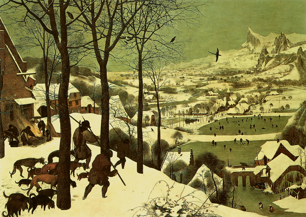
I am struck by how the composition, whether by chance or intention, is so reminiscent of one of the most beloved paintings in art history, Bruegel’s Hunters in the Snow.

bruegel-hunters-in-the-snow-31

In an interesting  online essay entitled, “How Can We Be Composed?- Bruegel’s Hunters in the Snow,” Nancy Huntting quotes from Eli Siegel’s commentary in Art as Composition:

“Pieter Bruegel’s Hunters in the Snow is a picture that tells us, Everything can be composed. Lines can be composed. The general direction of the picture is at a slant, or diagonal; the trees are assertively vertical; there are horizontal lines with the snow. Varying white shapes differ and coalesce. Houses, as volumes, mingle with snow as weight, and with space. Birds are diagonal, vertical, horizontal. The immediate in the picture mingles with a various middle ground, and a spacious, rising, misty background. Here is reality’s plenty caught hold of by Bruegel and arranged.”

Siegel’s formal analysis helps explain why a painting is so arresting. But it forgets the power of the sentimental elements (using the “s” word in its non-pejorative sense) of a painting — elements which, to an opened heart, provide pleasures all their own.

___________________________________________

UPDATE (August 2009)

In the Comments section, below, you’ll find an email from the artist’s grandson, Jim Jefferys, who came across this blog posting and wrote to me in June, 2009.  A few months later he sent along some photos and these additional information about his grandfather’s artistic efforts:

“The first picture is a snow scene with a chimney in center (oil on canvas, rather large – 36 inches square). This painting was to be given to the first male Jefferys in each generation. After me it goes to my son. … The painting I’m told was a fireplace that my great, great grandfather built when he came to this country. The building, after years and years of neglect, is the way my grand father saw it and painted it on a snowy day. A lot of his snow scenes were painted outdoors when it was snowing. My aunt can tell you he would take her as a little girl sledding in Manyunk, with oils, brushes and easel in tow. So, that’s the answer to your one question — he did paint in the snow.”

Copy of pic25679

“The second picture is the old Mill inn in Hatboro PA. which still stands to this day. [Note: unfortunately, the JPEG file for this painting could not be opened.] I was born and raised in that area. This building is still there and even though it has had renovations it still looks the same. The painting (watercolor) was completed on the day I was born. It was given to my father the next day for him to hold for me. Third picture (oil on canvas) is of Valley Green in Fairmount Park, Philadelphia. The building still there today and looks the same. I used to go trout fishing there when I was 16 years of age. It was one of my father’s favorite pictures.”

Copy of pic13043

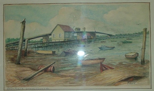
“Fourth picture [JPEG file was not openable] is a castle in Germany he did during  WWI (oil on canvas). He also did a portrait of Von Hindenburg when he was there after Germany surrendered. That picture is around somewhere, as one of the relatives has it. Fifth picture [JPEG file not openable] is a small painting of a run-down farmhouse (oil on canvas). I don’t know anything about it, just that I liked it and my grandfather gave it to me after I graduated from high school. Sixth picture is a watercolor of Dad’s Place in North Wildwood, NJ. It is still there and I was with my grandfather when he started the painting , back when we did not have bug spray for green flies, etc. I asked for the painting and he gave it to me. He knew if he gave it to me I would not forget the good times I had going to the shore with him.”

Copy of pic01563

“Seventh picture is down the shore somewhere, probably the same area,      but this home is probably gone from storms now. It was a twin set (my    sister has the other) and was painted the same summer as the Dad’s Place picture.”

Copy of pic25834

.

UPDATE (September 2014)

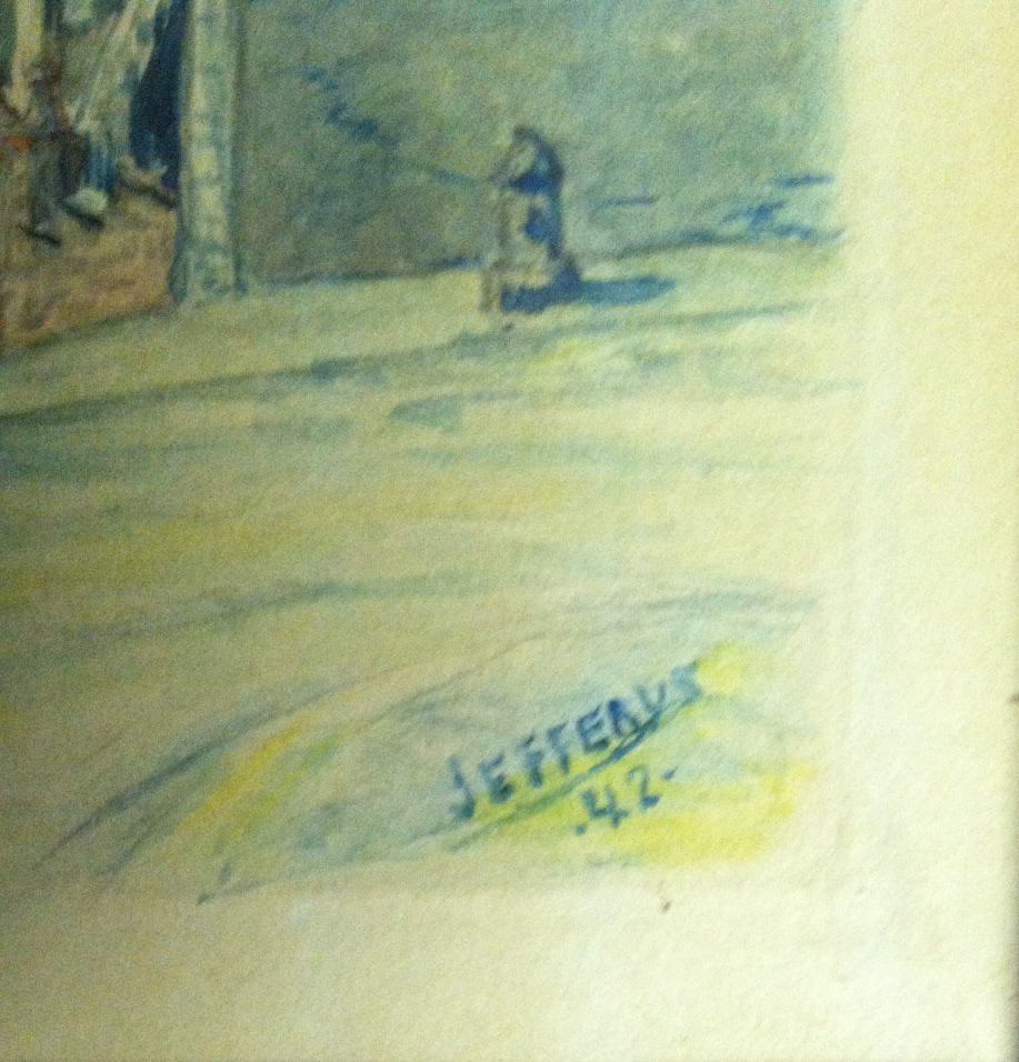
Here are photos of a 1942 watercolor by the artist, depicting the church and rectory of Saint John the Baptist in Manayunk. These photos were provided to me recently by Rev. John J. Kelly (see Comments section) who found the picture in a back room of the rectory. He writes: “The painting is quite realistic and a fine depiction of Rector street. On the left is Saint John’s, two schools and the  Church which still stands. On the Right is the Rectory  which still stands; so too do the walls at the top of the street and on Rector street.  It appears that the houses are all still intact. What is noticeably different is at the bottom of Rector street there is no high wall and SEPTA train tracks are missing from the painting.”

.

.

.

For comparison purposes, below is a detail of Jefferys’ 1938 painting, Boone and Grape St., Manayunk, showing the spire of Saint John the Baptist church and the roofs of two schools, from a higher perspective.

.

.

UPDATE – April 2015:

A new Google search for “James A. Jefferys” uncovered additional biographical information. The future artist was born in March of 1889 and died in July of 1969. The year 1938, when Jefferys painted the snow scene he titled Boone and Grape Street, Manayunk, shown at the beginning of this article, was a year of tragedy for the artist. In 1938 he lost both of his parents: (James Jefferys, 1851-1938) and mother (Anna Judge, 1864-1938).

The July 18, 1969 edition of the Des Moine Register newspaper published a short obituary for James A. Jefferys. It provides intriguing details about the artist’s early years:

“James A. Jefferys, 80, a portrait and landscape artist who painted European royally at the front during World War I, [died] in Philadelphia. He painted portraits of King Albert of Belgium and the Prince of Wales and later Edward VIII when they visited the front. He also made pen and brush sketches of battles.”

The Manifesto of Thompson Hotels

Sunday, May 10th, 2009

A mission statement spells out a company’s overall purpose and provides a sense of direction to decision making.  Among other things, it defines what the organization aspires to be.

The other day a friend sent me a link to a curious document that fits the general notion of a mission statement, although this one is labeled a “Manifesto.”  It also fills up an entire page, making it wordier than the run-of-the-mill mission statement.

The Manifesto was generated by Thompson Hotels, a wholly owned subsidiary of a privately held real estate development firm named The Pomeranc Group.  In 2007 the New York Times profiled the company’s entry into the world of boutique hotels.  The firm’s growing portfolio now includes nine hotel properties.

If you go to Thompson Hotels’ black-backgrounded homepage at http://www.thompsonhotels.com you’ll be faced with a flashing series of quotations.  Featured are the words of luminaries such as Che Guevara, Bob Dylan, Jean-Luc Godard, Federico Fellini, Oscar Wilde, and Jean Baudrillard.  I noticed that in the hotelier’s talky firmament, the French post-structuralist Baudrillard’s star shines brightest.  Two of his bons mots are offered for your delectation.  Meanwhile, in the background, hip music is heard.  An infinitely repeating loop plays a medley of eight instrumental selections, each abbreviated to 30 seconds.   The overall mood?  Retro groovy.  I felt smothered by an über trendy ooze.

If you visit the homepage, and I recommend you do, be sure to click on the word “MANIFESTO” found in the top border.  Or access the manifesto directly, here.  On that page you’re invited to test whether your personal identity matches the profile of an ideal guest as conceived by the hotel owners.  Here is the text of the Manifesto:

_________________________________________________________

Dear Guest,

In a world full of choices, we all need to question who we are and where we belong.

We set out to create a group of hotels that are effectively sophisticated and classically cool but small enough to provide personal service. Thompson Hotels are contemporary and elegant with an element of edge and surprise. At Thompson Hotels we believe there’s a place for refined, intimate style in a world of overly dressed up mega brands. We are not trendy boutique hotels. Our style is simultaneously timeless and avant-garde.

Who are our guests? Bohemian chic meets art-house-wise meets quiet yet radical elegance; really more of a mind-set than a demographic… “good looking revolutionaries.”

We wish we had known: Steve McQueen, Bobby Kennedy, Mick Jagger in 1973, Grace Kelly, Jean-Luc Godard, Edie Sedgwick and the fictional Royal Tenenbaums.

You’ll find us watching Darko, Eternal Sunshine of the Spotless Mind, Coffee and Cigarettes, Badlands, Blow Up, Le Mans. Or listening to The White Album, the Sex Pistols, Sinatra and we don’t pick sides between the East Coast and the West Coast.

We collect Hiroshi Sugimoto photographs, vintage Zippo lighters, matchbooks from cafes, quotes and one day, Basquiat.

We are a tribe, nomadic in nature joined by common threads. We are driving up the coast to a life of epic adventures… “It’s an anywhere road for anybody anyhow… but no matter the road is life”: Jack Kerouac.

See you soon,

TH

p.s. we will keep all your secrets and promises.

________________________________________________________

The term “fisking” is blogosphere slang for a point-by-point criticism of a statement, article or essay.  The fisking process involves questioning the analytical framework of the text and highlighting perceived errors.  It values close scrutiny, so the dissection usually proceeds sentence-by-sentence or paragraph-by-paragraph.  After reading the Thompson Hotels Manifesto, I thought, “Now there’s a document begging for a good fisking!”  I’m not sure I’m the man for the task, but what the heck, it’s worth a try.  Below is my token gift to art-house wise-asses everywhere.  Especially those who, due to their good judgment or bad finances or both, are destined never to find themselves embedded in a Thompson Hotel.

Caveat: It is possible the Manifesto is a small hoax, a put-on, a tongue-in-cheek bit of cheekiness designed to separate those who get it from those who don’t.  By the same token, maybe my text below is too.

So.  Now vee may perhaps to begin.  Yes?

In a world full of choices, we all need to question who we are and where we belong.

Come on, confess.  When you read that first sentence, sounding so eerily like an invocation, an invitation to prayer, you sensed a spiritual touch, did you not?  Maybe a tingle of  déjà vu ? Oops!  Lo and behold, the sentiment does fit nicely on a Church Sign:

church-sign1

.

We set out to create a group of hotels that are effectively sophisticated and classically cool but small enough to provide personal service. Thompson Hotels are contemporary and elegant with an element of edge and surprise.

Having established in the reader’s mind the notion of sanctuary, of a time and place for spiritual self-evaluation, the authors of the Manifesto decided to drop that idea cold.  Instead, it’s full steam ahead!  On to a relentless chug-chug-chug of words!  The modus operandi is simple.  Throw down words and phrases in hopes that something coherent will emerge.  The document becomes an onslaught of adjectives, adverbs, oxymorons and proper names.  Scatter shot onto the page, you watch them pile up into an enervating mass.  You encounter novel compounds (“effectively sophisticated”) as inert as the arbitrary pairings formed when kids fiddle with Magnetic Poetry words on a refrigerator door.

But let’s move on to the next bit of nonsense.

At Thompson Hotels we believe there’s a place for refined, intimate style in a world of overly dressed up mega brands. We are not trendy boutique hotels.

I like how a simple declarative sentence (“We are not trendy …”) stands out amidst the lazy mush (“overly dressed up mega brands”).  It turns out this defensive crouch (“We are not!”) has a back story:  one of Thompson Hotels’ co-owners has been quoted elsewhere as saying, “If you call us a boutique hotel chain, I’m going to scream.”  He prefers the term, small luxury hotel group.  The reason has something to do with branding and status.  But I am not Winston Smith (nor was meant to be) and shall not revise my text.

The term “Boutique hotel”  is commonly used to describe intimate, usually luxurious or quirky hotel environments — exactly the environment the Manifesto, however clumsily, purports to describe.  Check out Wikipedia’s article on the “boutique hotel” phenomenon for a consensus understanding of the term. The unavoidable fact is that these hotels are inherently trendy, occupying a segment of the industry characterized by constant churn, where players forever chase the next wave.

Historically, boutique hotels (sometimes also known as “design hotels” or “lifestyle hotels”) began appearing in the 1980s in trend-setting neighborhoods of London, New York, and San Francisco.  Typically, boutique hotels are furnished in a themed, stylish and/or “aspirational” manner.  The mission, the raison d’être, of Thompson Hotels is to participate profitably in this trend.

When responding to an absurd assertion, I often find it useful to summon the the clarity of the French.  What’s the best way to view a trendy Manifesto eschewing trendiness?  Comme ça:
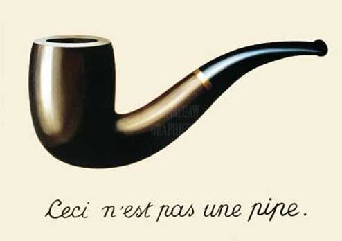
magritte-ceci-nest-pas-une-pipe-1

Though not as deft as Magritte playing with the way we attribute significance to images, the Manifesto does serve the purpose of highlighting a complicated relationship between the company’s self-definition and reality.

Our style is simultaneously timeless and avant-garde.

Reading this sentence, I was momentarily intrigued.  I like timeless.  On occasion I also like avant-garde.  The Manifesto brings them together again for the first time.  What’s not to like?  Should I worry about how stable the marriage is?  No, for the moment I’m willing to play along, especially since the sentence sparks a frisson. There’s an echo of T.S. Eliot’s Four Quartets.  In “Burnt Norton,” the first segment of that magisterial poem, Eliot posits:

Time present and time past

Are both perhaps present in time future,

And time future contained in time past.

If all time is eternally present,

All time in unredeemable.

Along those lines, did you notice the verse from Hebrews 13:8 on the Church Sign, above?  Jesus is the same yesterday and today and tomorrow.  The Manifesto promises your stay at a Thompson Hotel will be just like that too! Heavy, man.  Could be heavenly, too.  But this has got my head spinning.

I know once reason returns I will understand there is no way to halt what The Bard called “time’s fell hand” — especially not in the trendy business of boutique hotels.  After all, we’re talking about an industry in which a Thompsons Hotels co-owner cited with amazement the extraordinary “longevity” of an employee who’s been with the firm a whopping six years!  There are reports the company’s Gild Hall location in lower Manhattan (open for less than two years) is slated for a style makeover, as its star restaurateur is being replaced.  The company used to boast about its free Wi-Fi, but this year reversed its stance in favor of charging guests an extra $10.00 a day.

Timeless?  I report, you decide.

But take heed.  Clouds approach.  Pretentious gobbledygook lies straight ahead.

Who are our guests? Bohemian chic meets art-house-wise meets quiet yet radical elegance; really more of a mind-set than a demographic…

I was going to point out hyphenation flaws and other nits throughout the Manifesto (for those interested, a useful hyphen guide is found here; don’t say you’re learning nothing from this post).  But the prospect of correcting wrong notes in this Bohemian rhapsody reminded me of the scene in Basic Instinct when Michael Douglas (Detective Curran) comes upon the injured George Dzundza (Gus), who’s been attacked with an ice pick.  Curran tentatively applies a finger to block the bleeding from Gus’s neck.  But then he notices, in a growing panic, the full extent of the punctures.  He quickly runs out of fingers to stanch all of Gus’s fatal wounds.

I know, I know — you’re still wishing that the chain of “blah-meets-blah-meets-blah” would meet up with a meat cleaver.  And I’m reminded that the “fisking” process compels me to propose a remedial measure.  OK, then.  Let’s add one more hookup to the chain: Bohemian chic meets art-house-wise meets quiet yet radical elegance meets Freddy Krueger.

(Really more of a cathartic comeuppance than in your fondest dreams.)

“good looking revolutionaries”

Yes, Thompson Hotels defines its preferred clientele as persons who qualify as good looking revolutionaries.

Where to begin?  Smug, self-satisfied, and fatuous, this loose phrase sinks into a swamp of cynicism.  The concept of “good looking revolutionaries” belongs to a place where prices are known and values ignored.  Where everything is superficial, cosmetic, trivialized, reduced to fashion.  As for the not pretty faces and imperfect bodies of today’s equivalents of, say, Emma Goldman, Benjamin Franklin, Albert Einstein, Francis Crick, Betty Friedan, Balzac, Gandhi?

Oh for God’s sake, we don’t want the likes of them spoiling our hotels.

We wish we had known: Steve McQueen, Bobby Kennedy, Mick Jagger in 1973, Grace Kelly, Jean-Luc Godard, Edie Sedgwick and the fictional Royal Tenenbaums.

These appear to be the hotelier’s picks for the class of good looking revolutionaries.  The introductory clause (“We wish we had known …”) sets up the sad premise that these are folks no longer available to be known.  They’ve passed on.  They’re now guests at the Celestial Hotel.  Or, in the case of the still prancing Mick Jagger, his 1973-vintage incarnation (beautiful at age 30) cannot stroll through a Thompson Hotel lobby in 2009.

The prefatory language also presupposes that the persons cited were all once capable of being known, i.e., their feet once trod the earth.  News Flash:  Fictional characters, such as members of the Tenenbaum family, the clan given cinematic life by writer-director Wes Anderson, were never in fact alive.  Trust me on this.  If “we” harbor a desire to commune with fictional beings, the first thing to do is to express that desire using different rhetoric.  For example:  “I wish Holden Caulfield were a real person so that I might have a chance to talk with him.”

The second thing is, “we” need to schedule an appointment with a therapist.

You’ll find us watching Darko, Eternal Sunshine of the Spotless Mind, Coffee and Cigarettes, Badlands, Blow Up, Le Mans. Or listening to The White Album, the Sex Pistols, Sinatra and we don’t pick sides between the East Coast and the West Coast.

An orgy of mid-cult name-dropping, these selections sound like a basket of DVD’s and CD’s that Charlie the Tuna might gather for his undersea lair.  To prove his eclectic good taste.

Note the strangely truncated name (“Darko”) applied to writer-director Richard Kelley’s 2001 film, Donnie Darko. A Google search uncovers no evidence of actual people — whether they qualify as good looking revolutionaries or not — using the name “Darko” when discussing that movie.  Maybe Thompson Hotels is trying to start a new trend?  Say it ain’t so.

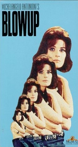
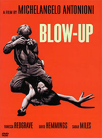
Next, notice the boast, “You’ll find us watching . . . Blow Up.”   Hmmmm.   It’s at this point that the needle on the Creepy-o-Meter starts to dance.  Remember, this is a Manifesto presumably concocted by sophisticated advertising copywriters (correction: make that effectively sophisticated copywriters), then reviewed and approved by company management, one of whom promises to “scream” if confronted with words or terms he finds inaccurate.  This means the Manifesto cannot be referring to the 1966 Michelangelo Antonioni film, “Blowup”.  As shown in the screen credits (one frame of which is below), the title of Antonioni’s film is one word.  While it is true the title appears hyphenated on some promotional and packaging material (as in the poster further below), it is never correct to render the title as two separate words.
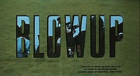
blowup-screen-credits

blowup-antonioni1

blow-up-dvd-cover

Assume, then, that the Manifesto’s reference to a “Blow Up” signals something else.  What might that be?  One clue is that this “Blow Up” is something that can be “watched.”  More particularly, it is something that you will find “us” watching.  So let’s take a step back and ask, who are the “us”?  Remember, the Manifesto is addressed to an anonymous “Guest” and is signed by “TH.”  So “us” likely is the hotel itself, as represented by its owners, managers and staff.  Or does “us” refer to the hotels’ guests?  Or to both groups?  What are they watching when they watch this thing called a — or the— Blow Up?  An act of violence involving an explosion?  A sex act?  Both?  Maybe posting a third quotation from Baudrillard would help readers solve the puzzle?  We must work through the night to find the answer; otherwise, I fear grave consequences.  Dawn may expose a pale, naked Manifesto, shorn of its raiments of erudition; a document written, edited and approved by a cadre of folks who, notwithstanding their air of knowingness, in the final analysis are (yes, it pains me to type the sentence’s final word, even though its etymology is French) poseurs.

We collect Hiroshi Sugimoto photographs, vintage Zippo lighters, matchbooks from cafes, quotes and one day, Basquiat.

More trendy brand names and other detritus.  Spare me.  This recalls a short-lived literary trend of a few decades ago, led by a set of young novelists.  They wrote prose with copious references to trendy high-end consumer goods, discos, real life celebrities, and other pop culture stuffing.  Their theory was that in our consumerist society, what you eat, wear, listen to, where you go clubbing, how you furnish your apartment, the famous people you encounter — all of that stuff taken together equals your identity.  Therefore, a list of a fictional character’s recent purchases would be a valid shorthand way to construct in the reader’s mind a fully-formed fictional personage.  The Manifesto shares this bleak and shallow world view.  It tacitly endorses the notion that you are what you consume.

In the present text, I was glad to find a soupçon of wisdom hidden in the final words of the sentence:  “… and one day, Basquiat.”  Implied are the principles of connoisseurship and deferred pleasure.  Collecting the work of Jean-Michel Basquiat demands maturity and a lot of groundwork.  Accumulating money, of course.  Finding a house or apartment with tall ceilings.  Most critically, developing a discerning eye — something especially important with an artist like Basquiat whose output was of notoriously uneven quality.  Assuming I’m not reading too much into those four words, the author deserves kudos for that little grace note.

We are a tribe, nomadic in nature joined by common threads. We are driving up the coast to a life of epic adventures… “It’s an anywhere road for anybody anyhow… but no matter the road is life”: Jack Kerouac.

True to form, a return to folderol.  I’m hoping you, dear reader, will join with me in announcing that we are growing bored by all the silly talk coming from this other “we.”  It occurs to me that you and I together are a “we” superior to the Manifesto’s “we.”  We possess largeness; the author of the Manifesto’s gotta wee “we.”

(The silliness is spreading.)

As for the tribal and nomadic references, I defer to another reader of the Manifesto, a person known as “jr”.  He (or, if “jr” is initials, maybe she) left a comment back in May, 2008, on a blog named Harry’s Place, in response to a piece about the Manifesto.  The commenter looked at the document as a marketing effort:

I suspect the purpose of the marketing is to make you think you will be more lucky to fuck an equally desparate fellow guest at this hotel and not feel too seedy afterwards.  “We are a tribe, nomadic in nature and joined by common threads” means “we want some casual nooky and we’re not thinking too much about herpes.”

Was “JR” weirdly prescient?  In 2009, Alexander Wang’s limited edition designer condoms became available for purchase exclusively at Thompson Hotels properties.

p.s.  we will keep all your secrets and promises.

My secret, which is not much of a secret, is that I have never been mistaken for a good looking revolutionary (alas).  If you ask what I myself will keep, the answer is, I will keep my money — far away from the hands of Thompson Hotels.

That I promise.

Frank Gehry Scores Big With Disney Concert Hall

Monday, May 4th, 2009

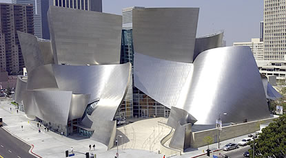
As with all great works of architecture, Frank Gehry’s Walt Disney Concert Hall in Los Angeles (completed in 2003) richly rewards visitors willing to engage their senses, reconnoiter the structure, enter its interior courtyards, experience the squeeze and release through tight and open spaces, enjoy its forms and gestures, admire its skin in changing light, absorb its physical beauty, and breathe sympathetically with its rhythms.

Professional photographers of the structure usually try to capture the totality of its iconic presence, highlighting the mass of shapes Gehry based on sailing, “wing on wing, the wind behind you.”

gehry-disney-concert-hall-la-4

Rarely is the building photographed from a ground level perspective directly across South Grand Avenue.  (In the photo above, you see a bit of the street’s asphalt in the lower left corner.)  This may be for the simple reason that the six-lane corridor is a noisy crossing, a sorry, off-putting, quotidian presence estranged from the visionary building emerging from its flank.  Then too, Gehry fans may be avoiding photographing the site from that perspective for fear of adding support to a common criticism of Gehry’s designs: that his buildings do not seem to relate “organically” to their surroundings.  And yet by standing on the east side of South Grand Avenue you’ll find yourself in the best position to see a defining architectural detail.

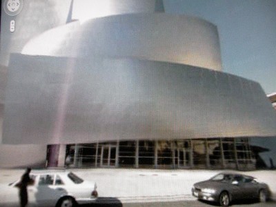
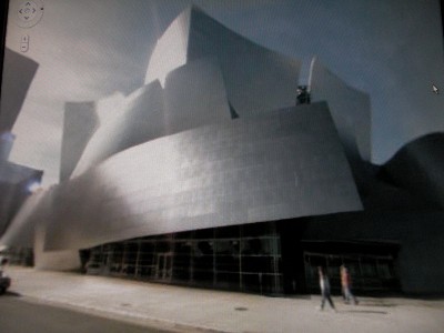
Google Maps, through its street view function, allows you to “walk” — or more accurately, to “drive” — past the street level facade.  Unfortunately, individual photos taken from the drive-by Google Van are of disappointing quality, as evident in the two screenshots below.

resized-gehry-1

resized-gehry-22

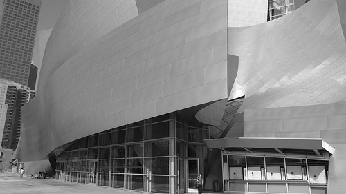
Flickr and other photo sharing sites contain pictures with finer resolution.  Here is a virtually identical shot, from a slightly more oblique angle (credit: core.formula on Flickr):

gehry-disney-concert-hall-la-1

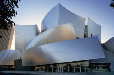
Finally, here is a full frontal shot, apparently taken from across the street (the ideal vantage point), looking straight-on at the sidewalk entrance to the building:

gehry-disney-concert-hall-la-3

All four photos include the detail that is of interest to me.  Focus for a moment on the base of the composition and the single, wide, rectangular shape that swoops across and projects outward from the building.  Of the dozen or so curving pieces or individual “sails” that comprise the skin of the structure, this one stands apart somehow.  Viewed unkindly, you might conclude it is an afterthought, an empty, ungainly, tacked-on piece, a doodle, a patch protecting the lowest portion of the building.  I disagree.  I think  it is different for a reason.  There are clues, if we open our eyes.

This particular piece has a more subtle rotation, is less of an arabesque, and more of a standard shape, than the other pieces.  Although made of unadorned sheet metal (stainless steel), it manages also to look like a blank billboard, floating with no apparent support above glass walls and doors.  Stretched horizontally with a slight incline from left to right, the entire form seems to be lifting up to grant you entrance to the ground floor.  Viewed in isolation, it is a kind of tabula rasa.

So, if the other individual pieces are whimsical cut-outs, enjoyable for their own sakes, what extra meaning does this frontal plane possess?  What does it remind you of?  What is it referencing?  Or, to ask the question another way, what do you want to project upon it?

One reference, consistent with the theme of the building as a whole, might be to a nautical flag flowing in a sustaining light breeze.  Although this is a reasonable thought, I think Gehry’s intention was something else entirely.

On closer inspection you notice ten horizontal lines of crimping, ten visible seams if you count the top and bottom edges as “lines.”  (This is best seen in the next-to-last photo above; in person, the lines are even more plain to the eye.)  As a matter of engineering, of course, these lines are merely the residue of a structural technique binding expanses of sheet metal, lapping the pieces together.  You may also notice that scores of  individual stainless steel sheets are the constituent notes making up the whole.  These small units (rectangles positioned horizontally) together compose a similarly-shaped, but much larger form.  This may be an example of a phenomenon mathematicians call self-similarity.

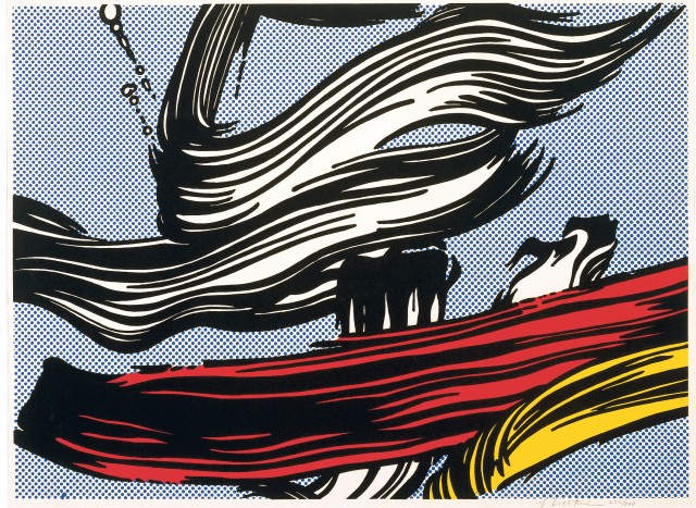
The horizontal, seamed striations lend a pronounced grain to the convex swoosh, reminiscent of Roy Lichtenstein’s brushstroke paintings and prints from the mid-1960s:

sp_229950_ho_dali_2

lichtenstein-brushstroke-painting-1

So we have an unfurled nautical flag and the choreography of a painter’s brushstrokes — both suitable ideas to associate with the architecture of this cultural center.   But I return again to the singularity of that expansive sheet above the entrance, to its discernible separateness even while it participates in the dance of the overall composition.  I think it wants to communicate something on its own.

It wants to sing.

Step back a moment and ask, What is the purpose of this complex building?  To house a particular form of art: music.  Philosophers devoted to the study of aesthetics consider music to be the highest form of art.  Music is unencumbered by the compromise of physical form.  It avoids constraints afflicting sculpture, dance, and architecture.  Goethe declared that architecture is frozen music.  It would not be surprising if a thoughtful and gifted architect such as Frank Gehry, tasked with designing a grand physical container for music making, were to choose to comment on this subject somewhere in his design of the Disney Concert Hall.  I think what Gehry decided to say is writ large in that floating blank sheet with ten horizontal lines.  Or, inching closer to the answer, he’s saying something ought to be writ large there.

As in Poe’s The Purloined Letter, the object of our search may be hidden in plain sight, so obvious that it becomes all too easy to overlook.

Remember that Gehry is a leader in adopting new tools to assist in the visualization, modeling, and execution of his visionary designs.  A man who cares passionately about the tools of architecture would no doubt reflect on the tools of the sister art, music, that his commission has bound him to serve.  (A side note: When I attended the final performance of the Los Angeles Philharmonic’s inaugural season at Disney Hall, I saw Gehry and his wife in their customary seats; the architect is an inveterate concert-goer.)

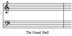
What I believe Gehry has chosen to emblazon across the entrance to his work is a replica of — an homage to — the essential tool for the communication and dissemination of music.  Here is the transformation:

grand-staff-1

grand-staff-31

grand-staff-42

The Grand Staff of music — a framework upon which notes are marked in relation to ten lines, five above middle C and five below — has in Gehry’s hands become a grand architectural gesture.  Remember also that this place is the Walt Disney Concert Hall — a place where imagination, creativity, and engineering magic can turn a pre-scored skin of metal into a giant treble clef (there to hold an unfolding melody) and an equally giant bass clef (there to host a supportive harmony).

A place where music begins.

_________________________________________________________

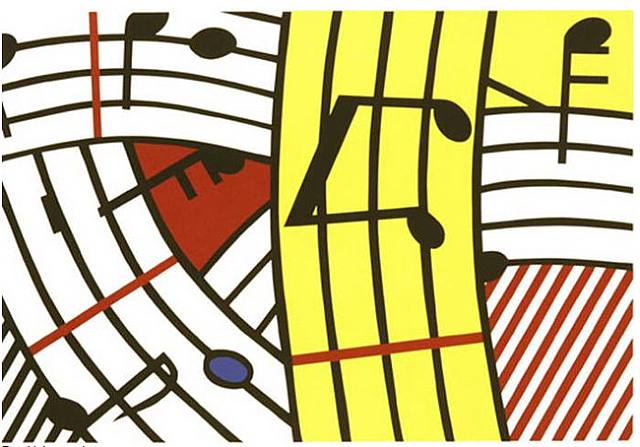
UPDATE 07-13-2009:  A different Lichtenstein print, created in 1995, recently came to my attention.  Roy and Frank, humming the same tune:

roy-lichtenstein-composition-iv-1995-screenprint-13-by-19-inches-edition-of-120

walt-disney-concert-hall-20-wikipedia

George Will: Engraft Him New

Saturday, April 18th, 2009

Oh, dear.  George Will is back in curmudgeon mode.  High dudgeon mode.  

Untouched by global warming, he’s stuck in a personal winter of discontent.  These days new life is emerging in Washington, “where flowers [are] springing, gaily in the sunny beam.”  But Will sees only “more clouds of grey than any Russian play could guarantee.”  Unable to “drop that long face” and prone to “nursing the blues,” Mr. Will nevertheless keeps up his prodigious output, slogging “o’er the swelling drumlie wave” to offer readers his latest column, one entitled “Demon Denim”  (or, “America’s Obsession with Denim”).  It can be found in the Washington Post, here

[Note: the preceding paragraph features a mash-up of Robert Burns and Ira Gershwin.  Specifically, quotations from “I Dream’d I Lay Where Flow’rs Were Springing,” (a Burns poem I’m memorizing for reasons later to be discussed) and the songs, “Shall We Dance” and “But Not For Me” (which, as interpreted by Ella Fitzgerald, I’m listening to in the car).  In other words, I came upon this material myself, wholly unreliant on a “Quote Boy.”  You remember “Quote Boy”?  He was the apocryphal, wild-eyed intern who, at Will’s command, excavated obscure quotations and erudite allusions, the overuse of which provides a signature tang to Will’s columns.  (“Quote Boy” appeared in Garry Trudeau’s satiric Doonesbury comic strip during the 1980’s.    Decades later, Google has become everybody’s always-available quote boy.)    . . .    I could go on and on, but for now, as the frustrated fifteenth century Judge cried in La Farce de Maitre Patelin, let us “revenons a ces moutons!”  Let’s return to my sheep, to our topic, to the subject at hand.]  

Mr. Will dislikes blue jeans.  Hates them, actually.  He says so over and over and over again in the column.  Fathers and sons dressed in blue jeans are “a sad tableau.”  Wearing jeans is “an obnoxious misuse of freedom.”   Espying a jeans-clad person, Will is inclined to think:  Shabby!  Infantile uniform!  Discordant!  Blight! 

Mr. Will, whose tenure on this mortal coil is approaching 68 years, confesses he’s worn jeans only once in his life.  The sin was committed under duress: donning denim was a prerequisite to his entering a very informal birthday party for former Senator (and ordained Episcopal priest) John Danforth.  Fresh with guilt from that dereliction two years ago, possessing little or no sense of irony, Will now lashes out at the rest of us sinners.  Do you find yourself rising from bed and reaching for your jeans?  You are, according to Will, putting on a “carefully calculated costume.”   (Alliterative appeal aside, the idiocy of this remark is breathtaking.)  When Will’s temper reaches a climax he borrows from Lord Salisbury (no surprise there) to describe the only legitimate wearers of jeans as “horny-handed sons of toil.” 

Here’s hoping the comedy team of Rachel Maddow and Ana Marie Cox, who recently giggled through a teabagging skit, discover Will’s column and decide to riff hysterically on that juicy phrase.

Some wags say Will was born old, that “senioritis” afflicted him from the very outset of his public career.  I have read his columns, and from them been informed and enlightened, for a very long time, all the way back to the 1970s when his columns appeared regularly on the back page of Newsweek.  A notable high dudgeon moment of that era, that I initially mistook as a spoof, was his movie critique entitled, “Well, I don’t love you, E.T.”   (Newsweek,  July 19, 1982).  Over the years I’ve harbored a hope of catching in his writing a tiny sign, some wee bit of evidence, some small sunny beam that might auger the start of a Benjamin Button-like process of reverse aging.  Not of body, mind you, but of spirit.  Just imagine if George Will were to retain verbal command even while freshness inspirited his perspective.  Imagine the touch of a goddess, her hands on the writer, intoning this blessing: “I engraft you, new.”  

[Two-word hint: The Bard.]

One objective statement in Will’s diatribe is the unoriginal observation that blue jeans trace their origin way back to practical workingmen’s gear, specifically, sturdy duds favored by miners treasure searching during the 1849 California gold rush.  And Will’s point?  Beats me.  Is he saying that today’s denim wearers are not mining for gold?  Well, ya’ got us there!  Is that any reason not to adapt/adopt the fabric to contemporary uses, life styles, and preferences?  Of course not.  Spend a  minute mining through Google Images and your pan will contain countless tiny, shiny photos of Mr. Will wearing a button down shirt.  He wears them on every sort of occasion, even at baseball games.  Now, it is widely believed button down shirts trace their origin to a practical solution demanded by polo players whose rowdy movements atop quick acting horses caused loose collars to go a-flapping, interfering with lines of sight.  Well.  Is Mr. Will qualified to sport that attire? 

Citing “original intent” as an argument to freeze sartorial evolution, to veto adaptive reuse, is just plain silly.  Foolish, too, in Will’s case.    

Another irony apparently lost on the author is how, notwithstanding his justified appreciation of Fred Astaire, Will’s elevation of the actor, dancer, and singer as a fashion roll model for all time does a grave disservice to the man.  Astaire had an easygoing, carefree, non-judgmental, practical, fun-loving, at times smart-alecky, live-and-let-live demeanor.  He liked to wear, instead of a belt, an old tie to hold his pants up.  Let’s say it out loud: Astaire had a quintessentially American demeanor.  His persona was a perfect match for a Gershwin tune —  two dozen of which he introduced to popular culture, largely through Hollywood movies.  And speaking of the Gershwin brothers, consider Ira’s satirical lyrics from 1938:

“The radio, and the telephone, and the movies that we know, may just be passing fancies, and in time may go.”   

Back then one imagines a coterie of literal-minded George Wills being heartened by the song’s prediction.  But I think an optimistic band of Americans sensed the passage of time would prove the wonderful irony of those words.  Happily, both Ira Gershwin and Fred Astaire lived long enough to confirm just that.  And now, in the year 2009, with Rushbo on the radio, a few billion people holding a telephone in their hands, and movies a worldwide passion, maybe it’s time to celebrate the fact that denim, too, is here to stay. 

Blue jeans are American.  Detractors, get over it.

I have never met Mr. Will.  I value his writing.  He often says first and best what others need to hear, as he did with great force during the most recent Presidential campaign.  It would please me very much if I were to bump into him (no graceful Astaire, me).  But there’s a good chance any chance encounter with Mr. Will, who lives not very far from me, would occur in informal environs — at a hardware store, say, or a CVS.  This means that, if he turned in my direction, he’d be scutinizing me as some blue jeans-clad stranger, suppressing his distaste and, gentleman that is is, keeping his thoughts (My, what a shabby, discordant, infantile uniform that fellow is wearing!) quietly to himself. 

Yet I would know what’s on his mind.

“The Tempest” at Steppenwolf

Friday, April 3rd, 2009

Wednesday night I attended a performance of “The Tempest” at Chicago’s Steppenwolf Theatre.  The show opens officially on April 5.

Scholars generally accept “The Tempest” as the final play Shakespeare wrote alone — a valedictory capping a career of two decades and nearly 40 plays.  There is in the work a nostalgic tone, mixed with autobiographic references, therapeutic disgorgement, final statements. 

I am no Shakespeare scholar (nor was meant to be).  I am not a credentialed critic.  With but poor power to add to or detract from accumulated commentary, I present these few notes on things that struck me specially:

My ears perked up at Trinculo’s remark (in Act II, Scene 2) about the eagerness of Englishmen to pay good money to see strange and awesome creatures brought back from distant travels.  The Jester notes how eagerly English purses open for foreign entertainment  (“they [the English] will lay out ten [coins] to see a dead Indian”) and he contrasts this with their disregard for a grotesque situation on their very own doorstep, namely, legions of destitute fellow countryment (“they will not give a doit [small coin] to relieve a lame beggar”).  With this cutting observation, I sensed Shakespeare was chastising many of us in the audience — people who happily paid to watch the playright’s show of “strange beasts,” while outside the theater, needs go unobserved, un-almsed.

Striking to me also was Prospero’s passionate warning (in Act IV, Scene 1) to the young lovers Miranda and Ferdinand against premarital sex, lest it poison their marriage.    Listening to this extended outburst (“[Do not] break her virgin-knot before all sanctimonious ceremonies may with full and holy rite be minister’d”) I wondered if Shakespeare was recollecting his own quick forced nuptials with a pregnant Anne Hathaway.  (Historians note that “the couple may have arranged the ceremony in some haste, since the Worcester chancellor allowed the marriage banns to be read once instead of the usual three times”).  Is Shakespeare blaming his own unhappy marriage on its flawed beginning? 

At the play’s end Prospero’s relationship with his brother Antonio is not repaired, an exception to the otherwise universal reconciliation.

Isn’t it unfair to reward the faithful Ariel merely with release from servitude?  That’s no reward at all.  Ariel deserves to be granted some grander thing, such as — would it be possible? — the gift of being made human.

The totally satisfying trajectory of the plot.

Actors must find it wonderful to inhabit the role of Prospero.  You are allowed to be not only a fully-dimensioned fictional creation, but also a stand-in for Shakespeare himself, the sum of his life experiences and thoughts.  In other words, you get to be Everyman.

I wonder if Gonzalo’s vision (in Act II, Scene 1) of an alternative, and better, world (with his key imaginings of “no sovereignty;” “nature [bringing forth] all abundance to feed my innocent people;” “all things in common”) was the inspiration for John Lennon’s “Imagine”  (with its similar vision of  “no countries;” “no need for greed or hunger;” “sharing all the world”).

______

Quick comments on the Steppenwolf’s bold and satisfying production of “The Tempest” (bear in mind that what I saw was a preview performance four days before the official opening):

The music composed for the pageantry of the play deserves high praise.  It is much more than “incidental” music.

The production design for this quintessentially timeless play was generally superb, save for the insertion of certain era-specific props into what is otherwise a stripped-down, “universal” stage design.  I mean the Apple laptop Ariel uses to compose and direct his high jinks.  (I hope Steppenwolf’s attorneys negotiated a hefty endorsement fee from Apple; a winning ad campaign could be developed upon the theme, “Capture Your Inner Ariel with an Apple”).  I also mean the retractable dog leash.  And the “timeless” aura would have been served better if Gonzalo had sat in a generic wheelchair device, not the one of contemporary design and engineering that the prop folks got from a 21st century medical supplies firm. 

The actors were superb across the boards (as well as  through the air).  One caveat: the wobbly Italian accent issuing from Stephano could use  realignment. [But see a reader’s comment below (added 04/06/2009)]

I was surprised at the stinginess of the audience’s reaction: only polite unsustained clapping.  No one stood to applaud.  No calling back the actors for further well-deserved appreciation.  Is this a Chicago tradition?  Is it typical of a Steppenwolf audience? 

_______

In the play’s lyrical, smiling Epilogue, Shakespeare directs Prospero to inform all of us who have absorbed his tale:  

“My project  . . . was to please.” 

This production very much pleases.  I for one was overwhelmed.

*

UPDATE (04-05-2009) – A first  review, generally positive, from Chicago Tribune critic, Chris Jones, in “The Theater Loop”: http://leisureblogs.chicagotribune.com/the_theater_loop/2009/04/steppenwolfs-mystery-island-is-up-for-grabs-in-this-tempest.html also available at http://www.chicagotribune.com/features/lifestyle/chi-0406-tempest-steppenwolf-ovnapr06,0,7681846.story

UPDATE (04-06-2009) – A blogger who was enchanted is Venus Zarris:  http://www.steadstylechicago.com/tempest.htm

One who was not is Nina Metz: http://newcitystage.com/2009/04/06/review-the-tempeststeppenwolf-theatre/

J. Scott Hill offers an ecstatic review: http://www.chicagostagereview.com/?p=3550,

As does Hedy Weiss of the Sun-Times: http://www.suntimes.com/entertainment/weiss/1512481,CST-FTR-Weiss06.article

Rob Kozlowski liked the show except for some stage elements and the rap song: http://chicago.decider.com/articles/stage-review-the-tempest,26212/


Rauschenberg’s “Signs” – An Appreciation

Sunday, March 29th, 2009

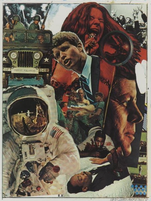
This is the first piece of art I bought.  It’s a silkscreen print created by Robert Rauschenberg.  He titled it “Signs.”

 rauschenberg-signs-for-blog


Rauschenberg conceived of “Signs” as a summation of the 1960s.  The piece was an aborted commission for a magazine cover. Rauschenberg released the work in June, 1970, through his gallery affiliation, Castelli Graphics, in an edition of 250 signed impressions. 

The 60s had turned Rauschenberg into a politically engaged artist, and he probably welcomed the challenge of coming to terms with a decade of seering experiences.  Exercising his natural affinity for collage, he would try to make sense out of an explosive arc of events that most observers felt defied all sense.  Raushenberg said the print “was conceived to remind us of love, terror, violence of the last ten years.  Danger lies in forgetting.”

I see “Signs” as an achievement at once topical and timeless.  Topical, obviously, since the artist has brought together a dozen immediately recognizable 60’s images — photos that were then still fresh with pain and joy.  Topical in a slightly broader manner as well, since the picture serves to encapulate the baby boomer generation’s creation myth.  But timeless also, thanks to the artist’s genius in re-fashioning stark images into something whole, something coherent, something aspiring to the redemptive.  

“Signs” belies the rap too often laid on Rauschenberg — that he surrendered to an aesthetic of “messiness.”  I was surprised to find such trash talk being repeated by the perceptive Louis Menand in his recent essay on Donald Barthelme, a modernist author who, Menand argues, boldly borrowed Rauschenberg’s collage approach, and with it made a notable contribution to literature.  (The article, “Saved From Drowning; Barthelme Reconsidered,” appeared in the February 23, 2009 issue of The New Yorker, available online here.) 

Distinguishing Rauschenberg’s methods from those of previous collagists, Menand makes the following assertions:  “[T]raditional collage arranges fragments into a form, and Rauschenberg’s collages are not organized in any ordinarily legible manner.   …  Most of Rauschenberg’s work … has no center.  Form, in the conventional sense of a hierarchical order, is one of the things he is trying to eliminate.”  Menand sees Rauschenberg’s signature work as embracing “the  illogic . . . the apparent absurdity . . . the arbitrary juxtapositions of radically disparate materials.” 

My purpose in this post is not to quibble with Menand’s characterizationHis article focuses on style, not on the decipherment of any particular work of visual art.  And who can deny that “messiness”  nicely recapitulates the ’60s decade itself. 

Rather, my purpose is to celebrate Rauschenberg’s triumph over formlessness when constructing “Signs.”  I want to praise his decision not to echo chaos or succumb to absurdity. I want to show how he chose instead to commandeer art’s arsenal against entropy.

How did he do this?  Through compositional devices,  juxtapositions,  reconciliations, and slights of hand that are deft, resonant, poignant, and funny.  Logic, not illogic, informs this work of art.  It’s there for all to see:

Tripartite form:   I think even on first encounter the viewer senses both stability and energy in “Signs.”  A feeling of stability derives chiefly from Rauschenberg’s reliance on a structure of three vertical segments nestled in a rectangular confinement.  Up the left side we see a moon-walking Buzz Aldrin claiming a large chunk of space in the frame; above and behind Aldrin is a four-man Army jeep, and above and behind that is a candlelight peace vigil.  The right side is topped with another black-and-white photo, this one of students attending an anti-war teach-in (the left and right corners are nicely balanced).  Below this the artist has positioned a professional photo portrait of a visionary-looking John F. Kennedy, tucked beneath which are a few stills from the Zapruder film that captured JFK’s assassination.  Sandwiched between left and right flanks are puzzle pieces that rise like a totem pole.  Starting from the base, this central composition comprises five elements: (1) the body of Martin Luther King as he lay in state at the U.S. Capitol; (2) a fallen victim of an urban riot; (3) two Vietnam soldiers flanking and supporting a wounded comrade; (4) Bobby Kennedy in earnest oration; and (5) Janis Joplin in wild performance.  The five stations of this central vertical segment are strengthened by an overlapping and interweaving of its parts:  for example, two arms, one begging, one blessing, reach over MLK; RFK’s hand slices through the Vietnam scene, in a call to halt the bloodshed.

Hierarchical order:   This piece most definitely has a “center.”  The central totem is a well-ordered pillar of life, a hierarchy of energy, a flow of life force.  It begins in silence with a photo of MLK in his coffin, his blood stilled by death.  It steps up to the bloodied man fallen in an urban riot.  It rises next to a trio of troops, wounded, bleary, yet upright.  It climbs to catch Robert Kennedy in the middle of an impassioned but controlled speech.  It crescendos with the ecstatic singing of Janis Joplin.  Think of it also as a fountain of youth —  all of its featured players are young (MLK, 39; RFK, 42; Joplin, 27) —  but one tinged with irony.  Only a few months after Rauschenberg completed his composition and released it to the world, Janis Joplin, his friend and fellow escapee from Port Arthur, Texas, died of a drug overdose.  With that death, the vector of the totemic form was altered.  No longer an unstoppable upward force, it now circles back on itself.  It has become a circle of life. 

Cohesion through repeated motifs:  With the possible exception of eyes, the human organ or appendage most crucial to an artist is, I would argue, the hand.  “Signs” is largely a composite portrait, which means it is all about faces.  But to my eyes it is the hands in “Signs” that resonate most strongly.  Notice how Rauschenberg emphasizes their physical meaning while also teasing out their symbolic importance.  A hand may choose to grip a bayoneted rifle to control others, or hold a candle in a hopeful prayer, or grasp a tool of communication (a microphone) to express freedom.  A hand’s fingers may splay to signify peace or extend to confer a blessing over the dead.  Our pride in seeing the iconic image of an American astronaut standing on the lunar surface is tempered when we realize that the sole visible hand of Buzz Aldrin is, in fact, not visible at all.  The hand is protected, swaddled like a mummy, rendered uncommunicative, unlike the vulnerable but expressive hands of earthlings here below.  As for the “face” of America’s technological triumph, it too is so denatured by protective gear as to become literally a “faceless” achievement.  

Unifying  light:  The strong sun and shadow on Buzz Aldin’s space suit blend seamlessly with the other wholly disparate components of the assemblage.  Rauschenberg achieves compositional coherence by making two tears in the material, at the top and right edges, to reveal a white underlayer.  We “read” this exposure as the source of bright light unifying all parts of the composition.  In addition to its formal function, the light poignantly supplies a sacred nimbus around the late RFK’s head.  It may remind us of a painfully ironic fact:  in the 1960’s, men of heart were extinguished, one after another, by head wounds. 

Meaning through color, direction, and tilt:   To begin with the most obvious color cliche, Janis Joplin is red hot.  Then, in the upper left corner’s overlapped images, note how the intense color of the guards gives way to calmer gray tints of a time-hallowed prayer for peace.  Consider also the way in which the dull unlit eyes of the vehicle’s headlights are shamed by the insistent glow of lit candles.  See how the quartet of uniformed men looks left (symbolically toward the past), their eyes shrouded from view, while the lone female representative of the vigil crowd turns her face rightward to meet the future.   If you stare at “Signs” long enough may experience a mild case of vertigo, as there appears to be no pure vertical line anywhere in the composition, no steadying plumb line straight down to the earth.  With the possible exception of the central image of wounded troops, every component is tilted slightly, as if confounding gravity and the comfort of rest.  This floating quality is consistent with Rauschenberg’s practice, in art works he called “combines,” of eschewing a sense of up or down.  In “Signs,” I think these off-kilter notes lend energy and flow to the work.  This is an appropriate way to express a dynamic, unstable period.

Surface versus depth:  In their original condition, the dozen photos that Rauschenberg selected to fill the rectangle differed in their objectively measurable proportions, lighting sources, coloration, and focus, and many other inherent qualities — not to mention differences in the sensibilities of a dozen different photographers responsible for the images. There is every reason for the assemblage to fly off in all directions beyond the frame.  Yet somehow the pieces settle into position, inviting the viewer to proceed with decipherment.  One thing that locks the parts into place is a bit of legerdemain, namely, the appearance of a round, clear glass paperweight on the flattened surface plane, just to the right of Joplin’s microphone.  Its clever purpose is to arrest fugitive movement.  We also notice a scraped trail, yellow in color, leading up to the paperweight’s current resting place, suggesting that the weight recently migrated diagonally from a position atop the fallen riot victim, stopping atop Janis’s tossed hair — hair the large convex lens magnifies and swirls into a psychedelic hallucination.

Generosity of details:  After all these years there are parts of “Signs” that newly intrigue me.  I’ve mentioned the intricate interweaving of imagery in the central “totem” which required careful scissoring of figures; why then is the JFK photo the only one with a sharp right angled corner left intact?  Why no contouring, no integration of that photo?  And is that a snippet of a Lichtenstein pop art painting under the President’s nose?  What is the meaning of  the eleven blue dots in the lower right corner, traditionally the location for the creator’s signature?  Bullet holes?  Is it fair to say the decade was “signed” by gun violence?  

Irony and humor:   Ironic visual juxtapositions abound in Rauschenberg’s work.  Here, in the upper left a military jeep purports to escort a trailing “CONVOY,” while the only group that’s “FOLLOWING” is a peace vigil in repose.  Also on display is tongue-in-cheek ribaldry.  Note how RFK’s mouth, at a moment formed into a suckling shape, approaches Joplin’s breast.  The rectangle’s black border can sturdily contain every image, except for two forces that pierce the top margin: the thrust of a bayonet (does its violation of the skin of the piece account for the drops next to RFK’s hand?) and the force, like rising red molten lava, of a volcanic Janis Joplin.  In a final flourish, the artist asserts his dominance: small block letter initials — R.R. — resting on the bottom margin, are so powerful that their strength can lift up, and playfully tilt, a hero astronaut.

____________________________________________________

“Signs,” screenprint (silkscreen, silk screen, screen print) in colors, 1970, signed in pencil, numbered [my impression is numbered 40/250] and dated, lower right, on wove paper, published by Castelli Graphics, New York, 35 1/4 by 26 5/8 inches; 895 by 677 mm.  Purchased from Makler Gallery, Philadelphia,  March, 1977.  I first saw the work not at a gallery but at a museum exhibition, the 1976 Rauschenberg retrospective exhibition staged at the Smithsonian’s National Collection of Fine Art (now the National Museum of American Art) in Washington, DC.  One room in the show was devoted to prints, one of which was “Signs.”  I was so bowled over by its power that I vowed to acquire an impression of the print, at whatever sacrifice it took.

__________________________________________________________

UPDATE 06-14-2009:  Today I came across a blog posting that provides additional background on the genesis of “Signs,” including key details that I believe had not previously been published.  According to an article posted on hamiltonselway.com on July 21, 2008, entitled “Rauschenberg – part 1,” the work was initially commission by Time magazine:

“’Signs,’ 1970, was originally created as an illustration for a Time magazine cover that would herald the 1970s. Rauschenberg felt, however, that the 1970s was really a continuation of the 1960s and inserted images of Janis Joplin, Martin Luther King, the moon landing, and the Kennedy Assassination. The cover was rejected by the Time Magazine editors who wanted to look forward to hopefully better times than the tumultuous 60s. Leo Castelli (Rauschenberg’s dealer at the time) stepped in and published a photosilkscreen edition of the collage.”

I’m struck by the joy expressed by Rauschenberg enthusiasts, as in this essay by John Haber on the occasion of the Rauschenberg retrospective in NYC over a decade ago: http://www.haberarts.com/rschberg.htm.   Can any other recent artist match him?