Archive for the ‘Art’ Category

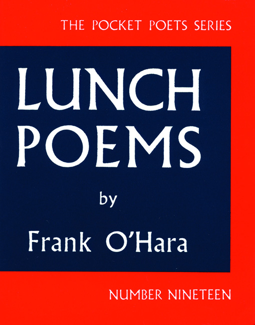
“Lunch Poems” by Frank O’Hara

Friday, August 5th, 2011

.

.

Frank O’Hara’s reputation seems caught in a holding period, an awkward stage preliminary to his work becoming universal and timeless. Consider, for example, the final scene in the opening episode in the second season of “Mad Men,” the cable TV series set in the world of advertising as practiced in New York in the early ’60s. We see the show’s protagonist, Don Draper, picking up a slim volume of O’Hara’s poems (“Meditations in an Emergency,” 1957). He recites the final lines from “Mayakovsky.” There is an ambivalence to the scene. Was O’Hara chosen less for the intrinsic merit of the poetry than to set an easy marker for a zeitgeist, the same thing the producers accomplish by highlighting the period-specific cut of Draper’s suit and hair? With friends like these, will O’Hara ever escape the mannerist ghetto of the “New York School“?

And so some readers may pick up “Lunch Poems” (first published in 1964) after seeing it praised as an emblematic cultural document of mid-twentieth century America. Yet even if the time-bound aura of O’Hara is the come-on, what makes you stay enthralled in his circle is his voice — a “thinking” voice as vitally American as Whitman or Frost.

There are 37 poems in “Lunch Poems” and their quality as well as their accessibility varies. The poems span a period from 1953 to 1964. This book is not a “best of” O’Hara collection, yet it does contain what may be his most durable poem.

A few of these short pieces are so recondite that they lose me. In a few others O’Hara raises an opaque scrim to suggest beauty beckoning from the other side, and these poems begin to “click” only after multiple readings. But the majority of the poems are freshly-minted coins granting immediate access to a lively, urbane worldview. While general knowledge of the New York cultural scene in the ’50s and early ’60s is helpful, these poems, at their best, easily communicate to us in a way undimmed by the passage of time.

Here is an endless succession of the poet’s friends, lovers, artists, musicians, and the parties, meals and conversation they create. Here are O’Hara’s travel experiences and his love of foreign languages (you could write an essay on the myriad uses of French in O’Hara’s poetry). The man wears his erudition lightly on his sleeve. He’s enamored by both the high and the low in American culture: “I am ashamed of my century for being so entertaining but I have to smile” (Naphtha, 1959). Another poem from the same year, Rhapsody, contains a premonition of his early death (at age 40) a few years later: “I historically belong to the enormous bliss of American death.”

Most delightful are his street-level ruminations, spinning in all sorts of directions, nurtured during mid-day breaks away from his curatorial duties at the Museum of Modern Art. A typical flight occurs in A Step Away From Them, which begins: “It’s my lunch hour, so I go for a walk among the hum-colored cabs.”

A new survey ranking the most walkable cities in America placed New York on top. Teju Cole’s recently published novel, “Open City,” set in contemporary Manhattan, is a current example of a continuing tradition of perambulating literary protagonists. A half century ago, O’Hara was walking these same streets, looking, speculating, daydreaming about the city. A fragment in an untitled poem from 1959 asks, “Where does the evil go when September takes New York and turns it into ozone stalagmites deposits of light?”

The cityscape serves as a platform for accessible philosophizing, as found in one of his best works: “The Day Lady Died”. Is there another poem where so much meaning resides in its title? At first glance the title rattled me, threw me off stride. In it I heard a rhythm, but an uncertain one. Then came the answer hit me: simply reverse “Day Lady” to reveal “Lady Day” — the nickname of blues singer Billy Holiday, whose dark night of the soul ended in 1959. The displaced “day,” her missing “day,” had to be displaced, it had to go missing from O’Hara’s page. The text of the poem recounts the day the poet walked the streets and avenues of Manhattan attending to errands. These everday events end when he spies a tabloid newspaper’s front page announcing Holiday’s death. It is the day after death, the first of many days denied her.

In the poem’s final stanza — in which O’Hara recalls hearing Holiday perform at the Five Spot Café — he accomplishes a wonder. He turns death into something other than displacement and omission. Memory overpowers death, converging time present and time past.

.

(An abbreviated version of this review is posted on Amazon, here.)
“Me, Molly Midnight, the Artist’s Cat” by Nadja Maril, illustrated by Herman Maril

Saturday, July 30th, 2011

.

.

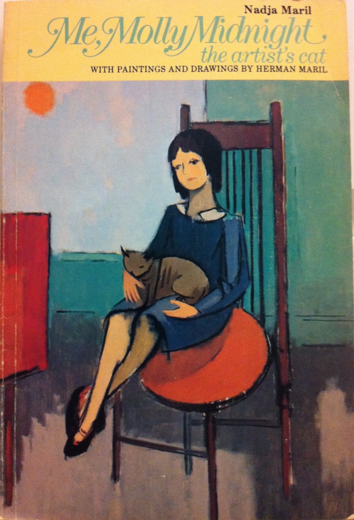
Like a heroine in a classic English novel who rises from lowly station to final prosperity, Molly Midnight, the feline star of Nadja Maril’s children’s book (published in 1977 and still in print), uses her wits and wiles to fulfill her destiny. Tracking her progress is as much fun (in miniature form of course) as following the exploits of her possible namesake, Moll Flanders.

Molly’s destiny is to serve as an artist’s model, and in that role she finds lasting stature. But more importantly, she achieves for herself “the same kind of peace and contentment” she sees each day on the face of her painter-protector, as he diligently works in his studio. Not a bad lesson for young listeners and readers.

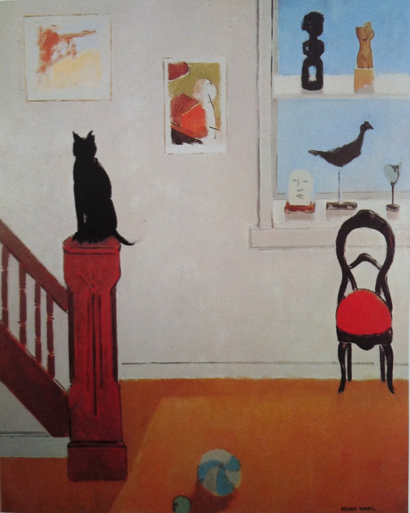
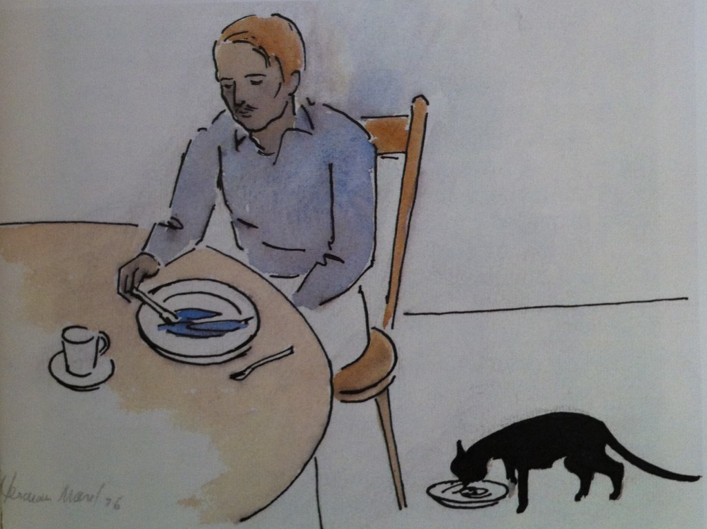
The book is illustrated with reproductions of 11 paintings by the author’s father, Herman Maril. Created over the period from 1962 to 1976, the pictures are a mini-exhibition of this gentle modernist and master of color. He also made four charming new drawings especially for this book.

.

.

.

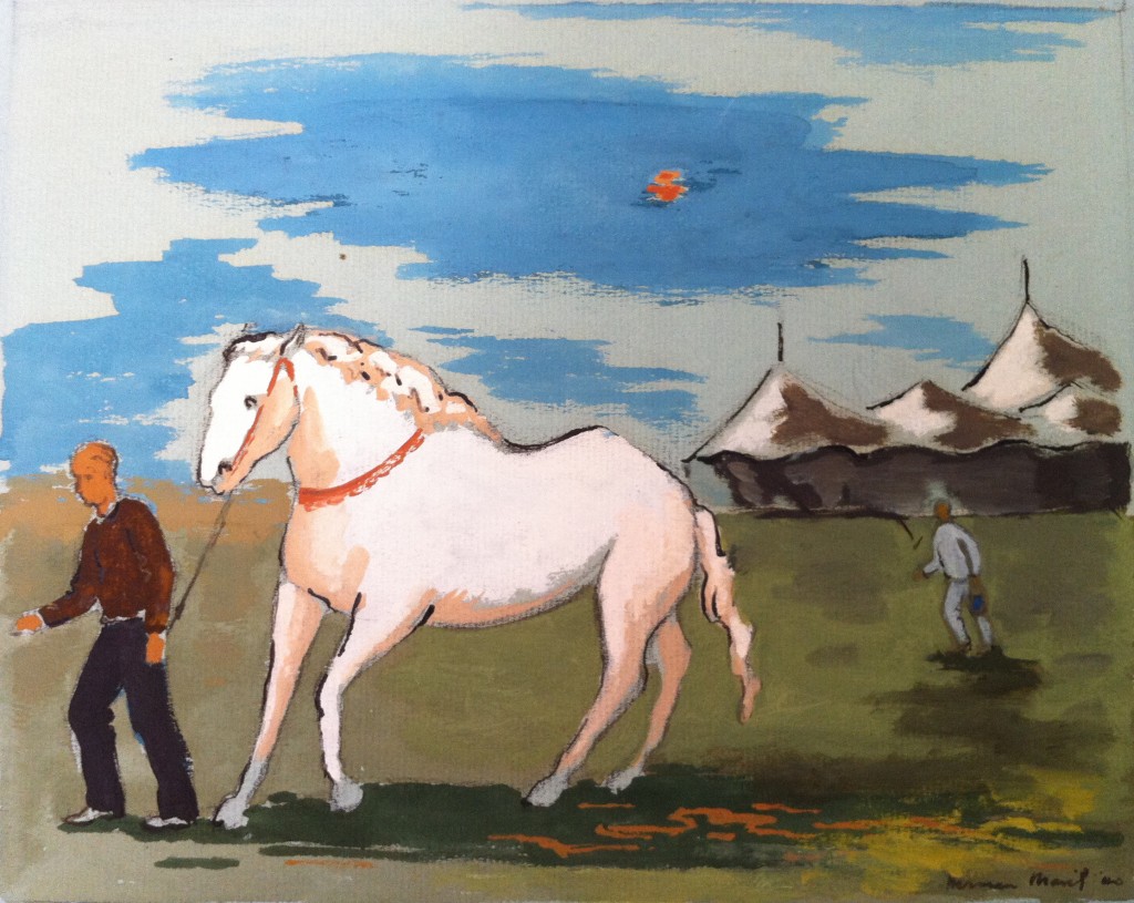
I own a small painting by Maril titled “Circus Horse” (gouache on light blue tinted paper, 1940). It pre-dates the paintings illustrated in “Me, Molly Midnight” by several decades, but is a good example of how brilliantly Maril could apply his fluid style to create a captivating picture of an animal.

.

.

A master of seascapes, landscapes and still-life works, Maril is an American artist who deserves to be better known. Currently on view at The Walters Art Museum in Baltimore (until August 30, 2011) is an exhibition of 40 of his works.

.

Edward Hopper’s “Approaching a City”

Saturday, July 23rd, 2011

.

This morning I discovered that the British newspaper, “The Independent,” has for the last several years been publishing a weekly series of short essays on individual works of art. The ongoing project’s name is “Great Works.” From what I’ve seen and read, most of the selections are interesting pieces you’re not likely to have come across in Janson or Gardner art history texts. The last 12 months’ profiles of paintings, sculptures and other works of art are available for reading online, here. Recently, art historian Michael Glover has taken over writing duties from Tom Lubbock, continuing a tradition of elegant and intelligent analyses.

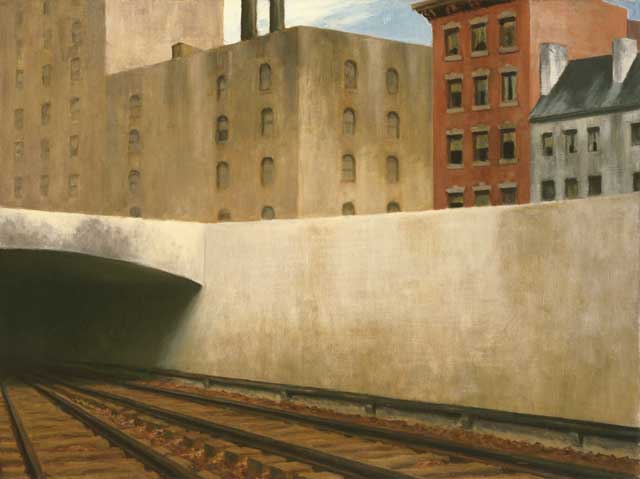
Last month Glover contributed an appreciation of  “Approaching a City” (1946), an Edward Hopper painting that now hangs in the Phillips Collection in Washington, DC.

.

.

Glover’s passionate analysis of the formal and thematic aspects of the work reminds me of the large rewards that every great Hopper painting surrenders to the discerning eye. Stand openly and patiently before a Hopper painting and you will experience muteness giving way to tantalizing meanings. Such is the case with this mysterious, unpeopled urban landscape.

Mr. Glover’s piece inspired me to share some thoughts of my own.

What I see in “Approaching a City” is an artist using the static medium of an easel painting to comment on the temporal, to upend our notion of time’s arrow, and, finally, to question the very American credo of progress. A tall order, yet Hopper manages all of this through the simple arrangement of buildings in the background.

What Hopper constructs in the upper portion of the picture is essentially a timeline, but one in which the conventional proposition (left to right = past to future) suffers a reversal. If you decide to read the frieze “backward” (from right to left) you will find yourself in the comfortable position of keeping chronological time. In the right margin you see huddled a pair of urban townhouses. These dwellings appear to date from the 18th or early 19th century (possibly from the Federal period) and they exhibit pleasantly solid forms, although their shutters have been lost and their brick fronts are now white-washed. To their left is a later 19th century residential building. It is two stories taller and retains architectural adornments such as a cornice, stone lintels, and warm brick facing. Side by side, you see that these are human-scaled, human-purposed structures.

Then, as you move again to the left, you encounter a gap. Even though the abutment of the railroad underpass obscures a street level view, you intuit this gap to be a cross-street. But you sense it is much more than that. For across this divide is a massive 20th century structure: artless, soulless (its fenestration dead-eyed), brutally concrete. It has laid siege to all remaining territory, even unto the sky. It is a chilling vision. If, in revulsion, you turn your eyes back to the right side, the twin dwellings will appear to be in protective hiding, cowering in fear of the future onslaught.

Hopper’s architectural tableau is a statement of decline, of devolution. What was Hopper thinking about? Our culture? Our politics? Our moral sense?

.

Additional notes:

1.  If anyone doubts my opinion of the rich rewards of Hopper’s paintings, ask yourself what other artist produced a body of paintings sufficient to form the basis for an opera?

2. In his essay, Michael Glover notices how the painting does not allow the viewer to rest contentedly anywhere on its surface. This is agonizingly so in the foreground: “Our gaze keeps shifting leftwards as if we are afflicted by some kind of a tic that jerks our head in that direction, as if we are being forced to acknowledge and inspect, again and again, that sucking promise of blankness, blackness” of the left-side tunnel. I thought it interesting that Glover assumes we are all destined to be drawn into the tunnel, that trains will descend into its maw. Speaking objectively, it is a matter of simple statistics that it is equally probable that a train we are traveling on will emerge from this tunnel. But emotionally I think Glover is correct. There is a sinister air of dread to the tunnel, indeed an air of surrealistic upheaval, that makes us think the darker direction is more likely. Compare the unlikely fate of Magritte’s train engine which happily emerges into domestic comfort.

3. In examining different stratum of time, time present and times past, Hopper can be seen as participating in a pessimistic strain in American thought and culture. It is of a piece with F. Scott Fitzgerald (“And so we beat on, boats against the current, born back ceaselessly in the past”) and Woody Allen (The “Midnight in Paris” visits to between-the-wars and Belle Epoque eras).

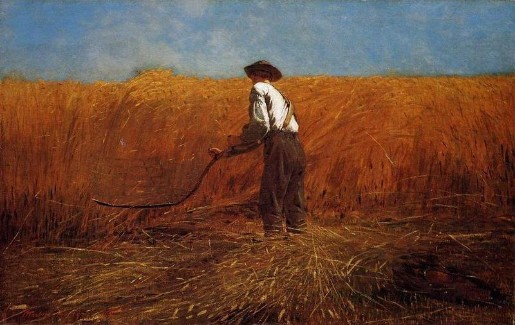
4.  Hopper painted “Approaching the City” in 1946, which I think is significant. Most Americans had reason to believe 1946 marked, finally, an awakening from years of nightmare: world-wide economic Depression, the rise of totalitarian regimes, the Holocaust, the horrible destruction of WWII. Surely some optimism was deserved. Was Hopper not of this view? Did he paint “Approaching the City” as rebuke to, if not an explicit rejection of, healing and recovery? I’m thinking now of Winslow Homer, who welcomed an end to the Civil War’s horrors in a different fashion. Here is “The Veteran in a New Field” (1865):

.

.

“How Do You Hug a Porcupine?” by Laurie Isop and Gwen Millward

Sunday, June 26th, 2011

.

.

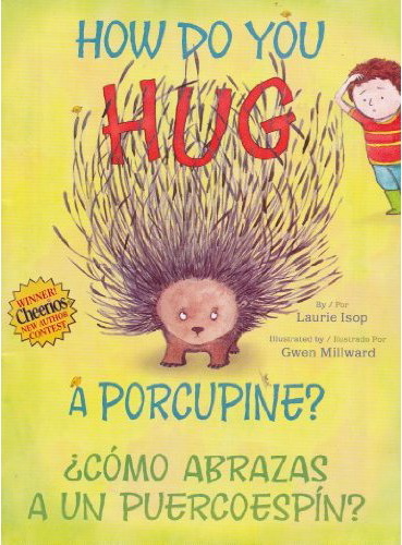
The storyline of Laurie Isop’s “How Do You Hug a Porcupine?” follows a simple and naturally pleasing formula. One by one, eighteen children pair up with one or more huggable animals.

What ensues is a festival of the warm-and-fuzzies.

Featured are a dog, cat, horse, cow, pig, ostrich, giraffe, bunnies, a yak and more. Coming in last is the most challenging of the potential hug receivers: a porcupine. But, Hooray! Undaunted, one little boy accepts the challenge. A big heart and patient ingenuity (hint/spoiler: his clever solution involves some well-placed marshmallows) are all it takes to succeed. The book’s final page delivers us into a warm embrace.

All of this activity is captured in Gwen Millward’s sweet, 1950’s-style illustrations, created with pencil, ink and watercolor. Her pictures will bring smiles especially to baby boomers who are now grandparents. Notable are several views of the porcupine with quills extended, and one of an elephant modeled in washes of gray. If your child or grandchild is a budding artist, and likes to draw animals, consider this book as a means to inspire her or him to learn the ways of watercolor.

A Spanish translation by Argentina Palacios Ziegler appears just below the original English on each page. Ziegler favors communicating the original text’s meaning, rather than slavishly duplicating its meter or rhyme scheme. (Her only arguable misstep occurs when she chooses to use the verb “de vomitar” to convey the idea of the boy’s stomach “feeling kind of queasy,” just so she can rhyme the previous line ending, “va a dar.”)

The moral of the story is as old as the New Testament and as ever-relevant as the Golden Rule: We must try to find a way to muster our courage and reach out to those who, because of some seeming difference, appear unapproachable. And yet there is nothing heavy-handed about the message in “How Do You Hug a Porcupine?” It is one of those books that can inspire, from young readers and maybe the listener in your lap, both childish and non-childish thoughts.

NOTE: The version of the book I read was one of 3 million free copies found in Cheeries boxes this Spring. It is a small paperback (7″ x 5 ¼”). On July 26, Simon & Schuster will publish a larger, hardback edition, but in English only. Expect copies of the bilingual version to pop up at used bookstores, such as stores on Amazon, here. Additional background from General Mills/Cheerios can be found here. Laurie Isop talks about her book in a video posted here.

.

“Nat Tate: An American Artist 1928-1960” by William Boyd

Friday, May 13th, 2011

.

.

The mail brought me a catalog for an exhibition of paintings by Jack Roth (1927-2004) opening this month at Spanierman Modern, in New York. Roth “worked his way through the major developments in postwar American art, from Abstract Expressionism, through Pop, and ultimately through Color Field abstraction,” yet today his work is largely forgotten. The catalog contains a well written essay — essentially a concise critical biography — by Thomas McCormick. It can be read (for free) here. As portrayed by McCormick, the artist had a strong personality, led a colorful life, and left a significant body of work (stored in a rural onion barn!). On the basis of the catalog’s reproductions, I’d say the large and colorful paintings of his final years are impressive, and they deserve to be rediscovered.

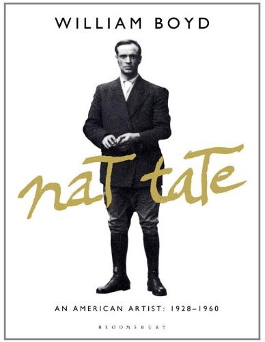
By chance, my learning about Jack Roth coincided with my reading a new hardback edition of British novelist’s William Boyd’s invented artist biography, “Nat Tate: An American Artist 1928-1960,” featuring a similarly forgotten (as he never existed) postwar artist.  Initially published in 1998 as a lark by the author in cahoots with friends David Bowie, John Richardson and Gore Vidal, this was a spoof intended to entrap and embarrass art world cognoscenti. And in fact the short-lived scam caused a minor commotion, as recounted here. But now, in 2011, what does this book offer us?

Not so much.

In book form, the text of the monograph, which originally appeared as an article in an art magazine, manages to occupy a mere 38 pages. More than half of those pages display only a few lines each. On those meager pages the remaining space is filled with fuzzy photographs or art reproductions. The total word count is less than 8,000, and the average reader can get through it in about half an hour. Is this the book’s saving grace?

Yes.

Boyd relays the life story of Nat Tate with no joy and little finesse. It struck me as a shallow exercise, a paint-by-numbers effort. Of course Tate had a pinched childhood, his father disappearing before his birth (Roth’s father died when he was four). Of course Tate’s nascent talent is discovered by a discerning few (as was Roth’s). Of course he brushes up against an idiosyncratic mentor (Hans Hofmann, at his summer school in Provincetown; in Roth’s case is was Clyfford Still). Of course he hobnobs with the art pack at the Cedar Tavern; drinks too much; suffers and dies young, a suicide. What disappointed me is that in telling this tale Boyd displays little interest in granting the reader any relief from the dull proceedings. He dots his portrait with few details, and there’s not much fun in the game of Where was this item cribbed from? (E.g., Tate’s omnipresent bottle of Jack Daniels, borrowed from de Kooning and Rauschenberg). The fictional suicide of Tate failed to move me, while McCormick’s simple description of Roth’s end did:

“In the early 1990’s, Jack Roth began to suffer early onset Alzheimer’s disease and in 1992, he retired from teaching. He had great plans to keep working and wanted to study cellular biology. The disease slowly progressed, and one day he announced to his wife that he just could not paint anymore. She recalls that. true to form, he never complained. Roth became completely debilitated toward the end of his life and died in a care facility in March of 2004, just shy of his 78th birthday.”

Disappointingly, Boyd does not illuminate any really new aspect of the New York art scene of the 1950’s; he offers no psychological insights beyond clichés, no fine descriptions of places and incidents.With the exception of a quick cutaway moment when he inserts a funny parody of a Frank O’Hara poem (it spotlights the abstract expressionist circle, and its opening line asks, “What if we hadn’t had such great names?”), Boyd’s prose is uninspired, serviceable at best. Something of equivalent quality could have been concocted by any of several thousand other writers, after a minimal amount of research. All of which is to say this is a plausible biography but it’s not very good. (By the way, how many would agree with Boyd’s assessment that “the three great pillars of twentieth-century painting” are Picasso, Matisse and . . . Braque? And how many would consider Boyd’s talent at describing Tate’s paintings to be on par with the creativity of Michael Cunningham in summoning up the works of fictional artists in “By Nightfall“?)

Some might argue Boyd was compelled to write flatly in order to disguise his tongue-in-cheek designs. I’m not convinced: after all, by the time Boyd was conceiving Nat Tate, biographers had long since given themselves permission to use novelistic techniques to energize non-fiction. Biography is not inherently dull.

What the purchaser of “Nat Tate” is left with is a souvenir of a practical joke, a remnant of a hoax that once caught some people unawares. What is the appeal of such a thing? Is anyone today interested in reading Konrad Kujau’s fake diaries of Adolph Hitler? Does this false artifact have any continuing hold over contemporary imagination and thinking? Isn’t it telling that virtually all reviews of the book discuss it as an art world event, and say little if anything about it as a reading experience?

Buy this book if you want an object to talk about, a conversation piece.

– – – – –

An abbreviated version of this review appears on Amazon, here.

.

Portrait of the Artist

Sunday, March 6th, 2011

.

.

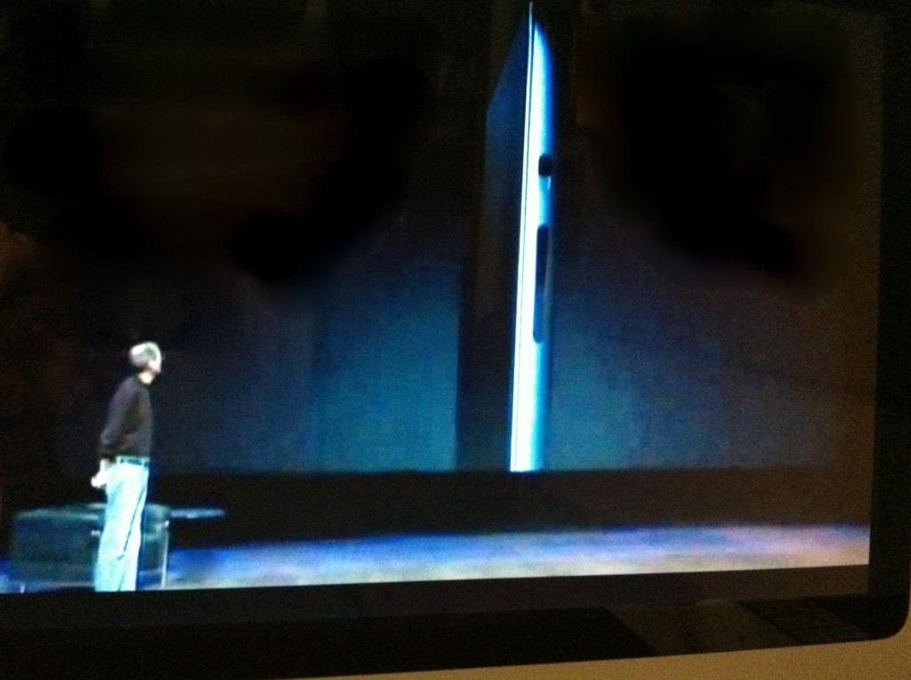
This is a screen shot from the video of Steve Jobs’ Keynote Address on Wednesday, March 2 (video available here). It captures the moment when Jobs reveals to the audience the look of his newest creation, the iPad 2. He gazes upon it, as if looking into a mirror, while sharing these thoughts:

“One of the most startling things about the iPad 2 is that it is dramatically thinner. Not a little bit thinner; a third thinner. (…) It’s dramatic.”

After looking at this object as something envisioned by Jobs, a design and a piece of abstract sculpture — is it too far-fetched for me to see this also as his self-portrait?

Vallie Fletcher: “Snow in the City”

Saturday, February 12th, 2011

.

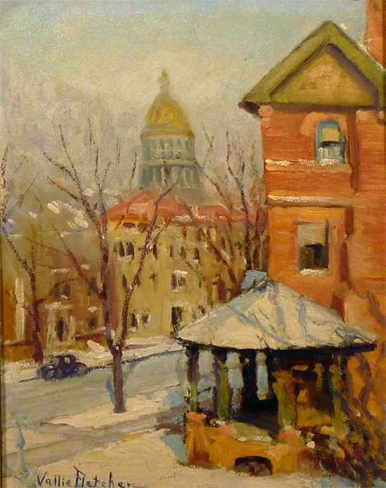
Today I was the winning bidder at auction for this painting:

.

.

I have an interest in American paintings depicting winter in the city. Budgetary limitations mean I keep my eye open for works by little known artists or by wholly unknown “Sunday” artists. An example of the latter is the painter James Jefferys, whom I profiled last year (see post, here). The fun of coming across these sparsely-documented painters is that it offers an opportunity to do a bit of detective work of one’s own.

This snow scene is a colorful oil on board, 16 by 12 inches, signed in the lower left. The artist, Vallie Fletcher (1874-1939), appears in American artists references and other sources. Those records indicate she was born in Beaumont, Texas. Her art studies took her to the Cooper Union in New York City and the Art Students League (she is mentioned in an 1899 catalog), although she returned west and was known as a “Texas artist.” Other than participating in regional competitions (for example, the 1927 Edgar B. Davis Wildflower Competition in San Antonio; she was not a winner), she did not leave much of a mark in the art world.

Regardless of of her lack of renown, I think she successfully achieves in this painting something direct and honest. The painting shares an approach to the urban landscape that was adopted by many of the best American painters of the 20th century.

My detective work started with a read of the scene depicted and the style of its execution. It looked to me to have been a spontaneous undertaking completed in a single afternoon. Some may object to using the term “en plein air” in this instance, since it seems Fletcher was comfortably positioned indoors, in a room on the second or third floor of the neighboring house, looking out through her window. Yet it’s possible the day grew warm enough for her to open the window, and, if so, describing it as an “open air” painting would not be incorrect.

Where was this painted?

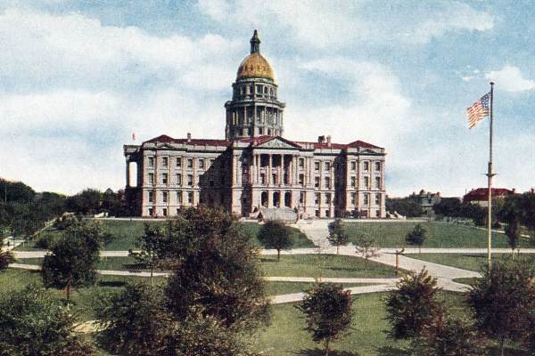
The chief clue to the location is the gold-domed structure in the distance. It has the look of a state capitol building. Using Google Images I found these pictures of the capitol building in Denver, Colorado:

.

.

.

It is a match, I believe. Even within the limitations of her loose painterly style, Fletcher has accurately captured the pillars and banding of the two-tiered masonry wedding cake that supports the gilded dome and cupola.

When did Fletcher paint this view?

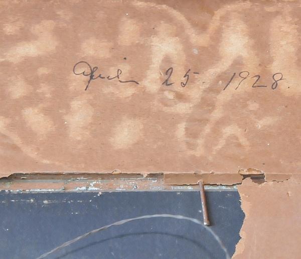
She died at the end of the 1930’s, but the Keystone Cops-looking vehicle parked on the street suggests to me the preceding decade. A notation (whether it is in the artist’s hand is unclear) appears on the reverse of the framed painting:

.

.

So, then, my working assumption is that Fletcher was in Denver and painted this view on April 25, 1928.

Is there anything to support this? Did it snow on that day, in that city? And if it did, was the storm sudden, surprising, and short-lived? Was it the kind of event that would keep the artist indoors? Was the cover of snow an evanescent subject she was eager to capture in paint?

Meteorological records maintained by the National Weather Service indicate that in Denver, on April 25, 1928:  RAIN CHANGED TO SNOW … WHICH BECAME HEAVY AND TOTALED 7.4 INCHES IN DOWNTOWN DENVER. DUE TO MELTING … THE MAXIMUM SNOW DEPTH ON THE GROUND WAS 4.0 INCHES AT 6:00 PM. THIS WAS THE LAST SNOW OF THE SEASON. SOUTHEAST WINDS WERE SUSTAINED TO 19 MPH WITH GUSTS TO 20 MPH.

Which is to say, Vallie Fletcher likely kept the window closed.

.

The circular porch, budding off the corner of the house, is a feature of many American Victorian-period homes of the late 1800’s.  See here and here.

Silenus in Georgetown

Friday, February 4th, 2011

.

.

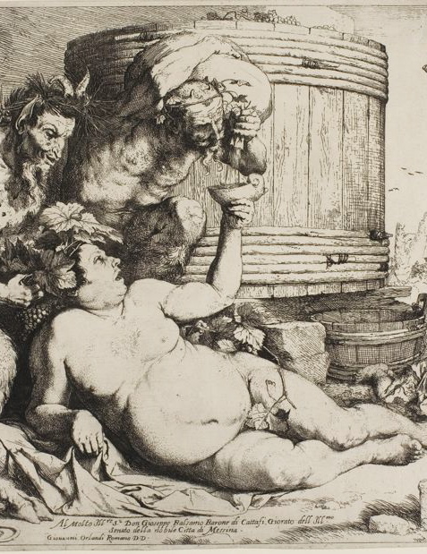
It is winter and cold and I am trying to remember summer through the aid of last year’s photographs, among which is this shot.

On fine summer days last year you could find this man sitting for hours on a sidewalk at the entrance to the Georgetown neighborhood of Washington, DC. I do no know his story, only his commanding presence. His diagonal pose, his pendulous belly, and the cup he raises to receive gifts of sustenance, recall depictions of the mythological Silenus, companion and tutor to the wine god Dionysus.

Except that, unlike the drunken Silenus, the man above knows he is in command.

.

.

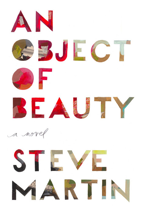
“An Object of Beauty” by Steve Martin

Tuesday, November 23rd, 2010

.

.

Many readers are going to enjoy this rich, wise and entertaining novel, especially those of you who happen to be:

Part of the art world. “An Object of Beauty” is a closely-observed story that traces the rise and fall of a young business woman in New York City, from 1993 to 2009. It is set in a corner of the commercial arena that traffics in works of fine art. If you work or play in the world of artists, art dealers, gallery owners, auction houses and their supporting enterprises; or if you are simply a curious outsider interested in what Martin calls “this insular collective” — then “An Object of Beauty” is sure to please. During the course of a well-constructed tale, Martin holds a mirror up to the art community’s denizens and their transgressions. If this is unfamiliar territory, you’ll want to be in “learning mode” as Martin (himself an experienced buyer, seller, and lover of art) pauses the narrative from time to time to deliver a mini art history lesson next to an illustration of a painting or sculpture (there are 22 in all) important to the developing plot. On a practical note, he also offers tips on how to negotiate your way through this strange jungle. Martin names names and reveals prices (throughout the novel there is a Balzac-like focus on the prices of everything).

Collectors. Although the reader’s attention is on the wily plots of the young careerist Lacey Yeager, and secondarily on the fate of her friend Daniel (an art critic and the story’s narrator), the author also populates the book with a parade of minor characters who suffer from the collecting disease. They occupy a spectrum from the savvy and methodical to the passionate, obsessive, and borderline insane. Martin displays a psychologist’s skill in exposing the emotional sources of their never-ending longing. If you are, or if you know, a capital-“c” Collector (of coins, dolls, baseball cards, whatever), you will likely find these sketches funny and right on the money.

Fans of Mr. Martin. We know Steve Martin can be a consummate happy clown, and part of the marketing campaign for this novel will (misleadingly) associate the book with his antic, feel-good, sweetness-and-light side. But Martin is more than that, as true fans and readers of his two novellas (Shopgirl and The Pleasure of My Company) know. And we value and trust his serious interests. Yes, there is wit in the new novel, and Martin’s trademark wordplay and love of paradox (“it was easier to sell a painting that was not for sale”), but he wisely suppresses his protean comedic chops in furtherance of the story. Fans of the author will appreciate that “An Object of Beauty” is a serious novel.

In telling a tale of misplaced values and money run amuck, in a world where relationships are polluted by greed and dishonesty, what comes through is Martin’s essential modesty. He avoids making definitive statements. While he may wax philosophical, especially on matters of aesthetics (his own seduction by the power of great art is evident), he makes no grand pronouncements. Instead, there is simply a keen-eyed view of human failings and, sadder still, a sober acceptance of the rarity of love. Martin is a quiet moralist.

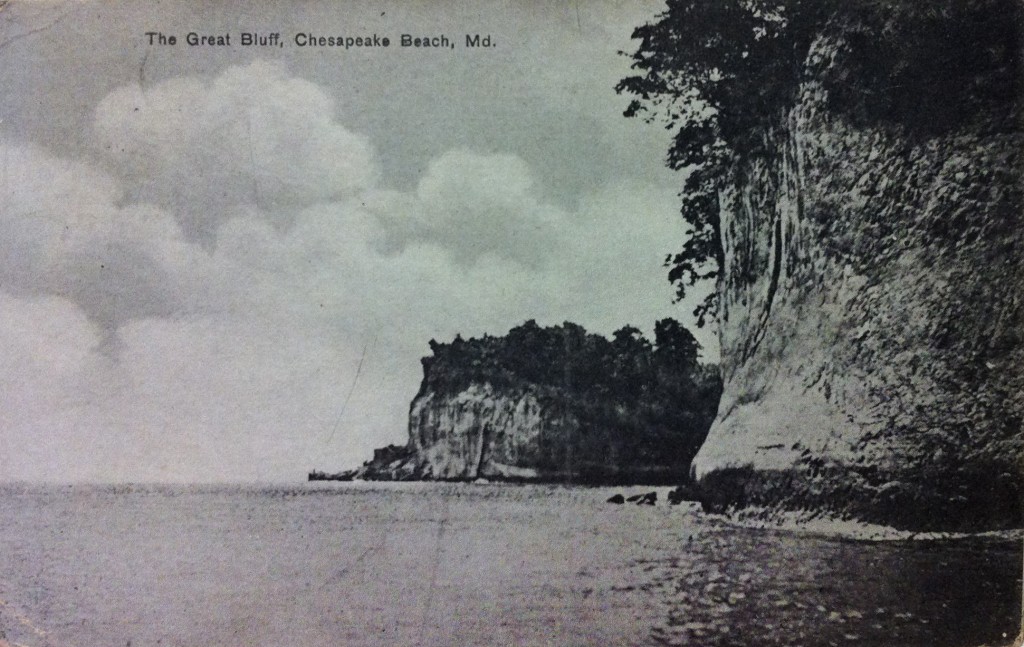
Edgar Hewitt Nye, “The Great Bluff, Chesapeake Beach, Maryland”

Monday, October 25th, 2010

Earlier in the month I bought at auction a painting by the Washington, D.C. painter Edgar Hewitt Nye (1879-1943):

.

.

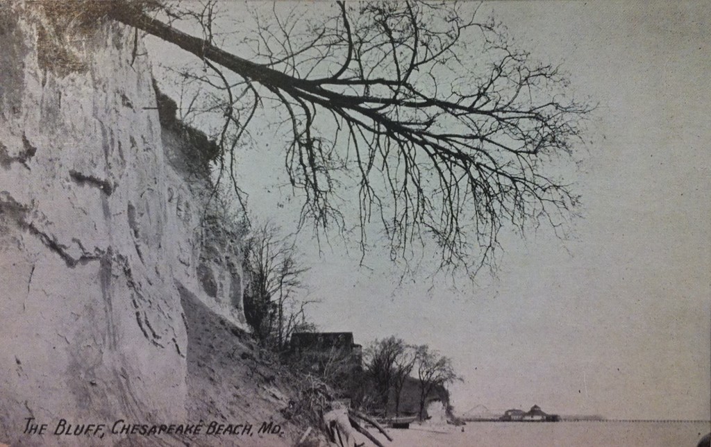
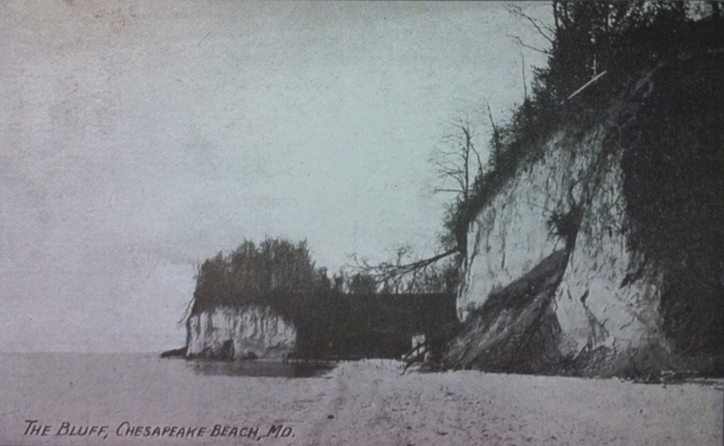
A plein air sketch (oil on canvas, 18″ x 22″, signed, lr, “E. Nye”, ca. 1920s), this bright landscape was untitled in the auction catalog and otherwise lacked information about its location. It looked familiar, though. The mystery was solved when I found a few souvenir postcards dating back to the early 1900’s when Chesapeake Beach, Maryland, was a popular tourist destination for day-tripping Washingtonians (who arrived there by railway) and Baltimoreans (who traveled by excursion ship). Edgar Nye was one such traveler. What he decided to capture on canvas was not the crowds attracted to the roller coaster and other boardwalk diversions, but an untouched stretch of Calvert Cliffs just to the south of the town. The cliffs are a fossil-rich, Miocene era formation stretching for 30 miles along the western shore of the Chesapeake Bay in Calvert County, Maryland.

Here, then, on a summer day, just a short remove from the noise of the resort, we can imagine Nye walking down to the water’s edge. He finds himself in a place where the air is laden with moisture, where baby waves break softly on the beach. It is here the artist plants his easel in the sand and spends a few hours playing with colors.

He puts to shame the dull penny postcards.

.

.

.

.